• About
  • Visit Gray Star Design
  • Minted Collection
  • Design Services
  • Contact

The Design Inspirationalist

~ Inspiring Ideas | Spectacular Creations

The Design Inspirationalist

Author Archives: melissaoconnor

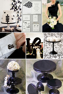
Classic Black & White Weddings

13 Thursday Oct 2011

Posted by melissaoconnor in Wedding Decor Ideas

≈ Leave a comment

Tags

black and white, classic, events, flowers, kim kardashian, luxury, weddings

There are tons of people out there that dream of a classic black and white wedding. Sure, it can be beautiful, but that is if it’s done right. Every designer has their own opinion of what looks good and what doesn’t so this is clearly my own. I try to inspire people with unique ideas and push them to customize their personal spaces and events so it represents them. Hopfeully resulting in great design.

We all know Kim Kardashian recently got married. Her wedding was a huge event that cost way more than I will make in 3 lifetimes. I guess since she had endless funds you would expect her big day to look spectacular. I think it was the opposite. First of all, there was nothing done that was special or unique. Second, there was way too much of everything. Totally overdesigned. Third, from the photos I saw it looked kind of boring.

Those are three things a wedding should not be. And what ever happened to the romance and intimacy of sharing your vows with the one you love? Obviously, that wasn’t on Kim’s mind. Here are a few elements of her day that surely didn’t inspire me.

Colors
Even though this was a black and white wedding, I feel the black overpowered the white immensely. It makes everything look so dark and masculine. The seating area looked like an event for a mens magazine more than a wedding. The ivory bouquets just fade away and its too bad because they were one of the very few elements that were actually pretty.

Overdone Elements
I’m not a big fan of big and tall centerpieces but as long as people can see each other and talk its not the worst it can be. Unfortunately, what was done here just added to the abundance of overapplied design. How many chandeliers can you have before the whole place looks gaudy and old fashioned? Less than what Kim had for sure. These were over the top and unessasary. None of it looked classic at all.

Stuffy Atmosphere & Bad Design
The tables had so much stuff on them I wouldn’t be surprised if the guests felt a little claustrophic. The first thing I noticed about the photo below was the table card. It looks like clip art and somewhat cheesy. Again, that unique artsy design element was nowhere to be found. On paper elements such as invites, seating cards, etc…is where your creativity can soar. But I guess if you’re not creative or have a good designer doing the work, it just won’t be successful.

Cake Design
And then we get to the wedding cake. Granted, you don’t have to have one. My fiance and I are having cupcakes instead because they are more our style. Plus, a little more fun. However, you should want your cake to match the style of the event which Kim did do. Unfortunately, this was a disaster as well.

Personally, I don’t like when people think they are king and queen status. This cake was friggin huge. But at least it could’ve looked somewhat beautiful if it was all white. Those two black sections just ruin the whole thing. A better way to incorporate the black is to use it for the ornate details which was actually quite gorgeous. It would of made them stand out more without being so overdone.

So, to sum it all up: Never have too much of something. Regardless of what you think or like, it will look overdone. Just because you love a certain pattern or color doesn’t mean you should see it everywhere. Why suffocate your guests with an overabundance of one element when you can incorporate numerous ideas into your design. It will only reflect your creativity. Also, remember that classic means clean lines and smart design. You can have a luxury feel at your event without going overboard and looking gaudy and old fashioned. And you can certianly have a classic feel without it being black and white.

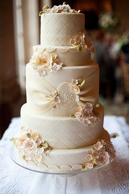
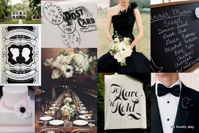
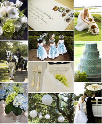
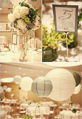
Be smart and do your research! Here are a few classic weddings that were done right. A little inspiration to leave you with 🙂
The Natural Palette

18 Thursday Aug 2011

Posted by melissaoconnor in Color Inspiration

≈ Leave a comment

Tags

color theory, colors, comfort, design, interior design, nature, relaxation

Recently I have been working with color expert Kate Smith which has inspired me to think more about color. Since nature is where I get most of my inspiration from I wanted to share some tips on how to use the natural palette in your home.

Analyzing a space is a smart thing to do once in awhile. I recommend you do it every six months or so. Tastes change and so does your life. Adjusting your space to your everyday is how you will get the most out of it. If you aren’t benefiting from your home than something is wrong.

A place to chill out should be reminiscent of what you love. What makes you truly relax? You should be able to clear your mind and be totally comfortable. For me, nature is my true love. So I take colors from Mother Earth and bring them inside my home. This means using neutrals such as blues, grays, browns, greens and colors from fruits and veggies. Natural tones in nature is what helps me sit back and relax. I find that most people feel the same.

{Seeing nature as a whole is truly breathtaking. From the sky to the water, you will find inspiration from every angle}

Now, this natural palette isn’t just an inspiration for color but also how to use it. If you look outside the Earth seems so perfect. Trees have brown bark to ground the green and many other lighter colors in their leaves. The sky is all sorts of gorgeous blues, whites and grays while the ground presents more greens and browns. This is a free lesson in how to coordinate and arrange the colors in your home. So, mirroring nature in your space is a great way for successful design to shine. Put the sky on your walls so the room feels airy. Depending on the tone of the color, the trim can be crisp or slightly blend in for a softer look. Antique whites, creams and light grays work well.

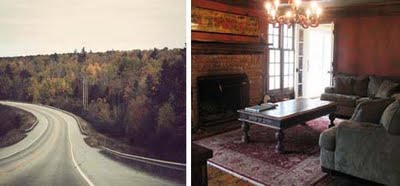
{Look closer to find various tones and hues of color on trees during different seasons as well as notice all the different colors in the leaves}

{The colors of autumn are a true inspiration for spaces to feel warm but relaxing}

Flooring should ground the room and provide the necessary weight for all other elements to feel natural. You don’t have to necessarily have really dark floors, but they should be a darker color that the walls so their is some type of contrast. The more texture there is, the more warm the space will feel. Eco-friendly options such as bamboo, cork, cement, brick and stone play very well in a space like this. Adding a rug will bring even more comfort and warmth.

Your furniture should also help weigh down the space. Having pieces appear as they are floating can somewhat look out of place. You want a consistent feel to the room. For a more spacious design stick with darker toned pieces that aren’t heavy. Maybe they have open shelving or thin legs, either way it will work. If you want or need more heavier furniture that is fine too. Just take note of size and the proportion to the other pieces in the room.

{A great example of how texture in natural elements can bring so much to a space. See all the various gray tones from the Earth}

Your accessories are the details that bring the whole room together. From the window treatments and lighting to smaller decorative items such as vases, trinkets and books. Pops of color bring a whimsy and fun feel to the room so look to the seasons for inspiration. The details on your furniture play a big part as well. Handles, knobs and special engraving can sometimes make or break a space. If you are incorporating grays in the room I suggest colder metals like silver. Warmer highlights such as golds and brass, go well with autumn colors like red and orange.

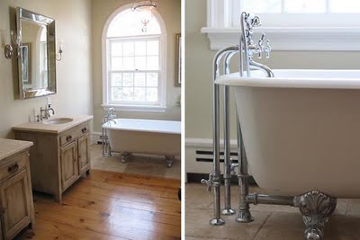
{Light wood tones and soft colors make this bathroom calm and soothing. Silver blends nicely with the colors of the room}

Color is so important when creating a space. Especially, one that is meant for relaxation and comfort. Feeling like you are at a park when in fact you are sitting on your couch reading a book, is a successful result to great design. Everything should accent each other and blend in a natural way, as if the room was meant to look the way it does. So sit back, take a look around and discover the power of color in your home. Creating a space that empowers, inspires and keeps you calm when the day is rough truly makes all the difference. I can guarantee you will be smiling more often.

Beautiful Banners

14 Sunday Aug 2011

Posted by melissaoconnor in Awesome Shops, Crafty Ideas, Decor Ideas, Events & Parties, Wedding Decor Ideas

≈ Leave a comment

Tags

banners, crafts, design, etsy, events, new york weddings, parties

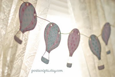
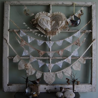
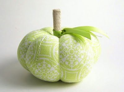
Being a lover of anything handmade, it is no surprise I would love banners. Not only are they easy to display but there are so many out there, the possibilities are endless. Plus, you can make them yourself. If you are not as crafty as you wish you were, here are some I came across on Etsy that I think are really great.

These would be an awesome addition to any event. Having items that are unique and handcrafted really add a sense of style like no other. Have fun shopping around and I hope these give you some inspiration to design with confidence and style.

Betty and Barclay

Barbara A Ryan

Bnute

Earmark

Postscripts

Funky Junk Art

Seapinks

20 Wednesday Jul 2011

Posted by melissaoconnor in Awesome Shops, Shopping

≈ Leave a comment

Tags

animals, art, crafts, etsy, handmade, jennifer hall, nature, seapinks, sewing

I am in love with this Etsy shop! Handmade items are one of the only few things that truly get me excited so when I came across this shop I had to share. You have to really appreciate the love and hard work that goes into making these precious items. All are beautiful and whimsy. Right up my alley. Support indie artists out there and shop on Etsy people!

Seapinks‘ designer, Jennifer Hall is not only an artist but a craftswoman as well. Based out of Virginia, her love of nature and animals truly shows through her work and the details are impeccable. Some will make you laugh and others will make you go “awe” but you can guarantee they will all put a smile on your face. Stop by her shop and take a look around!

Here are some of my favorite items:

← Older posts
Newer posts →
color in films sound in color art inpsired palettes
art and design the home events and parties weddings real weddings color inspiration film-reviews historic places news and updatesminted


minted.com

Enter your email address to follow this blog and receive notifications of new posts by email.

Archives


martha

Magnolia Rouge

Screen Shot 2014-04-23 at 2.29.10 PM

Etsy

Screen Shot 2014-04-23 at 2.18.10 PM

logo

Screen Shot 2014-04-23 at 2.42.13 PM

P&PBlogHeader

wedding chicks


ruffled

Screen Shot 2014-04-23 at 2.47.49 PM

Screen Shot 2014-04-23 at 2.16.32 PM


lauren-elle-photography

jenlombardo

logo_website

site-logo1

kelly_dekenipp_logo

homelogo

Website Powered by WordPress.com.

Privacy & Cookies: This site uses cookies. By continuing to use this website, you agree to their use.
To find out more, including how to control cookies, see here: Cookie Policy
  • Subscribe Subscribed
    The Design Inspirationalist
    Join 1,379 other subscribers

    Have a WordPress.com account? Log in now.

  • The Design Inspirationalist
    View site in Reader
    Manage subscriptionsSign upLog in
    Report this content
    Collapse this bar
Loading Comments...