• About
  • Visit Gray Star Design
  • Minted Collection
  • Design Services
  • Contact

The Design Inspirationalist

~ Inspiring Ideas | Spectacular Creations

The Design Inspirationalist

Tag Archives: neutrals

Portfolio: Mood Board & Color Palette for Musical Journeys

06 Saturday Jun 2020

Posted by melissaoconnor in Portfolio

≈ Leave a comment

Tags

branding, colorpalette, creativeservices, design, graphicdesign, moodboard, natureinspired, neutrals, webdesign

A mood board and color palette I created for local business Musical Journeys filled with calm neutrals and nature inspired hues. It reflects the style and feeling you sense when in Rebecca’s music studio so I wanted it to reflect that. I am currently building her website and am excited to help a fellow Long Islander upgrade her business. Can’t wait till it’s all done!

Interior Palettes: A Fresh Workspace

30 Wednesday Aug 2017

Posted by melissaoconnor in Color Inspiration, Interior Color Palettes

≈ Leave a comment

Tags

color inspiration, color palette, design inspiration, fresh, fresh workspace, interior design, interior palette, neutrals, office design, pop of color

I think it’s important to have a workspace you love and one that reflects your style and personality. This one right here is a nice example of what a clean and organized space can look like and I just love how modern and it is too. A neutral earthy palette is the foundation for the toned down pops of color, allowing them to shine. The room is weighted down successfully by the darker cool hues and the fun patterns and artwork add so much visual interest, without being too busy. The white walls and desk help to keep the overall space clean and fresh. I wouldn’t mind working in here every now and then. Would you?


Image credit: domino.com

Interior Palettes: Pop of Happy

30 Sunday Jul 2017

Posted by melissaoconnor in Color Inspiration, Interior Color Palettes

≈ Leave a comment

Tags

color inspiration, color palette, design inspiration, interior design, interior palette, neutrals, pop of color

I love neutrals, so all white spaces make me happy. They bring calm and quiet to a room and set a nice tone for all types of design. This living room speaks to me with such grace. A lighthearted soft spoken, “come on over.” Cool neutrals are the foundation for cheery blues and pinks to shine. And bringing the outside in with plants and flowers always adds a pop of happy.


Image credit: domino.com

Easy Breezy Neutrals

14 Tuesday Mar 2017

Posted by melissaoconnor in Color Inspiration, The Home

≈ Leave a comment

Tags

calm and peaceful, color inspiration, neutrals, playing up textures, stylish home, white is not boring

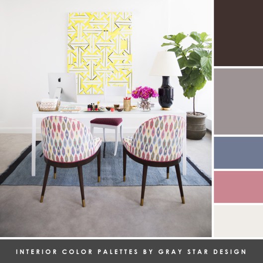
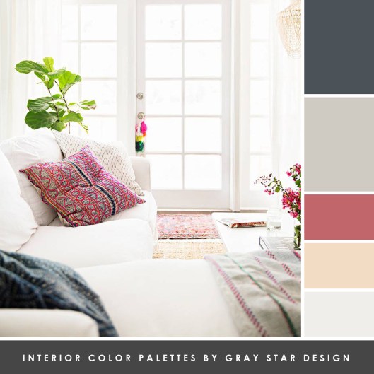
Using neutrals in your space is a great way to create a calm and peaceful environment, while being stylish and modern at the same time. I think a lot of people must feel like they don’t know where to start when it comes to incorporating this lighter palette into their home. But it doesn’t have to be complicated. Here are a few things to keep in mind:

White is not boring
White is certainly not dull when it comes to interior design. First of all, there are all different hues so definitely look into these options before starting. Second, having white walls can really make or break a room, but it all depends on the other colors in the space as well. Think of white as a color that blends with everything else around it, so it depends on that support to really shine.

Playing up textures
When you truly want to design a space with neutrals, and I mean whites and creams, considering texture is a huge factor. Each will bring a special characteristic to the room and help evoke a feeling, which will really bring the whole design to a new level.

That seamless feel
In the end you want a space that is warm and inviting, so make sure you keep the hues at a minimum. Having 10 different whites fight the spotlight isn’t cool. And I can guarantee the design will really look off. Decide on a few and go from there. You want them to blend but stand out on their own so stay within the same tone. Otherwise, you will have one that doesn’t seem to fit the puzzle.

0ad0a5ac-0a8a-4726-8c5d-1698290fa60c
(Image credit: Country Living)

292ddc6e-b69d-4aa4-ae3e-7a9151641b07
(Image credit: Country Living)

bc8f38d4-8e15-46a0-82a0-3d216894876e
(Image credit: decoholic.com)

db0a8bc6-2bdd-409b-8531-dd1632cd83b4
(Image credit: householdredesign.com)

00c63550-d0bb-471b-84c9-3753828951e6
(Image credit: aplacetogetlost.com)

← Older posts
color in films sound in color art inpsired palettes
art and design the home events and parties weddings real weddings color inspiration film-reviews historic places news and updatesminted


minted.com

Enter your email address to follow this blog and receive notifications of new posts by email.

Archives


martha

Magnolia Rouge

Screen Shot 2014-04-23 at 2.29.10 PM

Etsy

Screen Shot 2014-04-23 at 2.18.10 PM

logo

Screen Shot 2014-04-23 at 2.42.13 PM

P&PBlogHeader

wedding chicks


ruffled

Screen Shot 2014-04-23 at 2.47.49 PM

Screen Shot 2014-04-23 at 2.16.32 PM


lauren-elle-photography

jenlombardo

logo_website

site-logo1

kelly_dekenipp_logo

homelogo

Website Powered by WordPress.com.

  • Follow Following
    • The Design Inspirationalist
    • Join 1,386 other followers
    • Already have a WordPress.com account? Log in now.
    • The Design Inspirationalist
    • Customize
    • Follow Following
    • Sign up
    • Log in
    • Report this content
    • View site in Reader
    • Manage subscriptions
    • Collapse this bar
 

Loading Comments...