• About
  • Visit Gray Star Design
  • Minted Collection
  • Design Services
  • Contact

The Design Inspirationalist

~ Inspiring Ideas | Spectacular Creations

The Design Inspirationalist

Tag Archives: vintage

Our Country Cozy Kitchen

06 Thursday Feb 2014

Posted by melissaoconnor in Everyday Design, The Home

≈ 1 Comment

Tags

country kitchen, diy, home sweet home, kitchen renovation, redesign, vintage

My husband and I finally have finished our kitchen renovation, which we started last spring. Most of the work has been done for awhile but we recently added the finishing touches this winter. I’ve been sharing this process since we first bought our home 2 years ago. You can see the initial redesign here: Home Sweet Home-Kitchen Redesign

This was how it looked before we did this final renovation:
Cozy Kitchen

I had a few main inspirations for the space but mostly wanted a country kitchen with all free standing pieces. You can read more about the items we bought here and a look into my search for artwork here.

Here are some photos from the demo:
renovation

My husband, Dan, and I are both very handy, being artists and DIYers. We painted all the pieces we found, built a custom sink cabinet with open shelving, and transformed a breakfast nook into an island. We purchased a new oven and sink, as well as all new lighting, new flooring, and paneling for the ceiling, which Dan installed and painted himself. The sink butcher block countertop was purchased at Ikea but the other two were bought online unfinished. I sanded and stained them myself to save on the cost. We had a little help with the demo and drywall, which took longer than we planned due to issues with the house, but all in all we can’t complain. We are both just happy it’s done!

Of course I am always changing things up but its great to have a space we love. My vision came alive and we both worked as a team to create our dream kitchen. Here is what it looks like today. All our hard work paid off.

Our Country Cozy Kitchen

Our Country Cozy Kitchen

7

Our Country Cozy Kitchen

4

Our Country Cozy Kitchen

Our Country Cozy Kitchen

Our Country Cozy Kitchen

3

A Little Ones Sanctuary

29 Wednesday Jan 2014

Posted by melissaoconnor in Everyday Design, The Home

≈ Leave a comment

Tags

animals, art, baby, carnival, children, childrens room, classic, color, crafts, decor, design, Industrial, interior design, kids, kids room, sports, themes, toys, vintage

A Little Ones Sanctuary

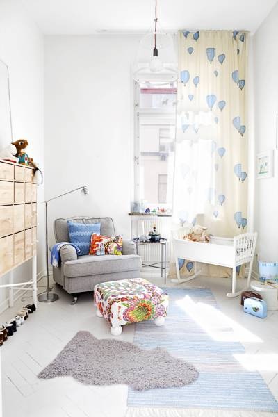
I have always loved the idea of designing a children’s room. There is something special about creating a space for a little one to grow, develop, and draw inspiration from. Besides these few must have ingredients, I feel the child should feel warm, cozy, comfortable, and free as well. This is the space they will call their own and most likely be the place they will spend most of their time as they get older.

My husband and I are planning to start trying for our first child and you can bet I have already thought of how to design the baby’s room. I have to admit, I have been thinking about it for years now so it’s no surprise I am super excited to actually make it happen. I think being prepared and always being ahead of the game is the best policy. Plus, with something so important as this task, you should take all the time you need. Hence, starting early!

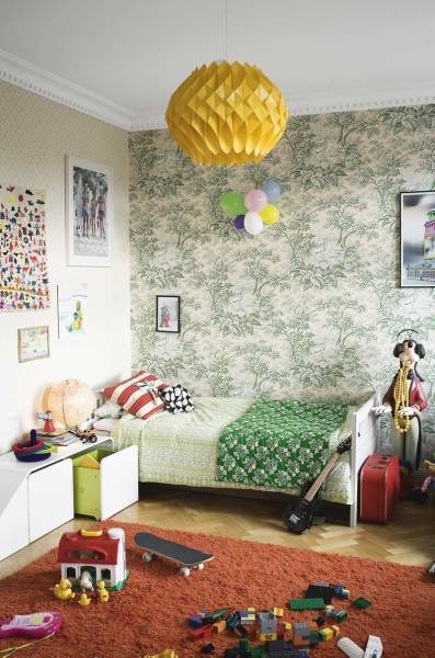
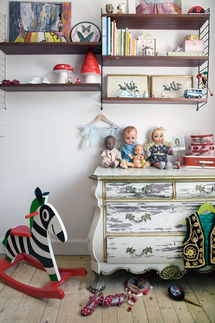
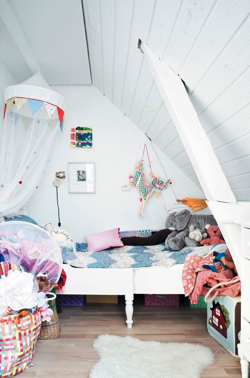
Personally, I love an androgynous space for a child. One that is not too girly or boyish, a nice mix of feminine and masculine. And anything that looks “baby” is pretty much out. I prefer a space a child can grow up in, not one that has to be redesigned every few years because they grow out of the decor. So a sense of maturity is essential. And adding small touches of childlike features here and there are easy to do. I plan to showcase vintage elements, art & handmade items, and books – three things that will truly feature the style of the space and bring a cohesive look to the room.

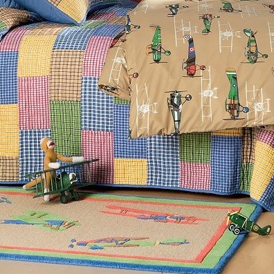
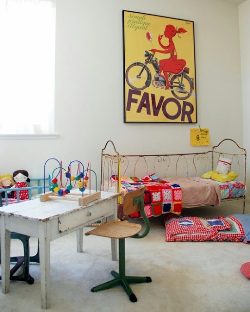
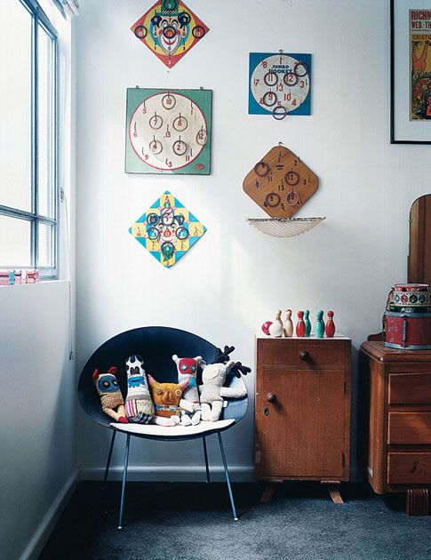
I also do not like themed rooms. When I mean theme, I am talking about sports, animals, carnival, zoo, stuff like this that can really go overboard, which I see all the time. Instead of making the whole room look like a football field, placing a few quality inspired pieces throughout the space. The same thing with an animal theme. A child shouldn’t feel like they are in a zoo. It can get a little hectic with wall decals, lamps that matchy-matchy with bedding, and accessories that take over the space. And most of the time all these designs/items are created for baby, so the overall look is a bit dated and overdone. Here are few examples of how to successfully incorporate a theme:

A Little Ones Sanctuary
Photo Credit: The Boo and the Boy

A Little Ones Sanctuary
Photo Credit: Noosh Kids

A Little Ones Sanctuary
Photo Credit: Kids Decorating Ideas

A Little Ones Sanctuary
Photo Credit: Cozy Cottage Cute

A Little Ones Sanctuary
Photo Credit: HGTV

Color is an important element to think about. How do you want your child to feel in the space. I am a big believer in neutrals, they are used throughout our whole house. These  hues allow for relaxation, inspiration, calm, and stability in the space and are the perfect fit for a baby and young child. Sorry, but a bright red and blue room just isn’t a great choice. You want your kids to feel grounded, especially babies. Too much stimulation can really affect their overall being.

So, here are more spaces designed for children that work. They may clearly show a theme, but that theme isn’t kitschy, its a style. And that is what you want to go for. Creating a specialized look and feel should be the priority, while considering your little one’s needs and wants. It is their space after all. Enjoy!
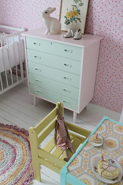
A Little Ones Sanctuary

A Little Ones Sanctuary
Photo Credit: The Boo and the Boy

A Little Ones Sanctuary
Photo Credit: The Boo and the Boy

A Little Ones Sanctuary
Photo Credit: Smile and Wave

A Little Ones Sanctuary
Photo Credit: The Boo and the Boy

A Little Ones Sanctuary
Photo Credit: The Boo and the Boy

A Little Ones Sanctuary
Photo Credit: Zyrafy Z Szafy

A Little Ones Sanctuary
Photo Credit: Orsa Maggiore Vintage

A Little Ones Sanctuary
Photo Credit: Barn and Bo

A Little Ones Sanctuary

A Little Ones Sanctuary
Photo Credit: nietylkodzieciaki

A Little Ones Sanctuary
Photo Credit: Blessed Wild Apple Girl
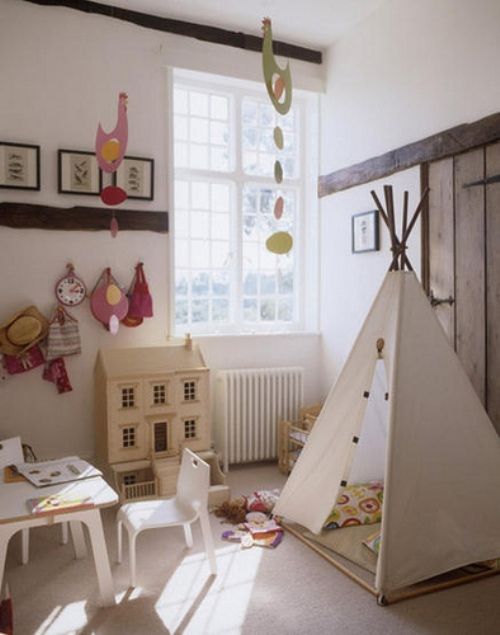
A Little Ones Sanctuary
Photo Credit: Your Home Only Better

View More on My Pinterest Board

The Bathroom of Our Dreams

22 Wednesday Jan 2014

Posted by melissaoconnor in Everyday Design, The Home

≈ Leave a comment

Tags

bathroom, bathroom renovation, country, design, gray, home, interior design, master bath, modern, rustic, subway tile, vintage, white

This past December, my husband and I had our master bath renovated and are still amazed how different it is. Since our home is old, the bathroom was pretty bad. It was super outdated and closed in, ceramic tile everywhere, a large jacuzzi tub we hated, a toilet that was far from eco-friendly, no heat, and a storage space that was unusable. There was plenty to dislike about the space.

This was the bathroom in its original state before we moved in:
Fresh and New

For two years, we lived with the minor changes we were able to do, which was basically change out the vanity/sink and light. Not much, but we didn’t have of a choice. I wish I could say we got used to it, but it was something neither of us could get used to. Then finally, it was time to gut it and make it beautiful.

There wasn’t much we could do about the actual space of the room but being a designer, I know certain tricks to help open it up and feel more airy. I did this with a neutral palette, white tile on the floor and shower, and opening up the storage space so we can actually use it. Before there was a wall there with a small door, but now its all open shelving which I’ve hidden behind a fabric curtain. We also got a new tub that is a normal size, which opened the shower area up tons. We also read reviews for great water softeners for our plumbing and our skin!

As far as style, I wanted the space to have a modern appeal but showcase classic vintage elements. I did this through a gray/white color palette and keeping everything white so it looked clean and crisp. You can’t get anymore classic with subway tile so I chose that for the shower and for the floor, small hexagon tile I have always loved. It brings me back to my Grandmother’s house in Brooklyn when I was a little girl. Now I get to have that memory everyday!

The Bathroom of Our Dreams

The small shelves are from Home Decorators and the medicine cabinet was a great buy on Overstock. The rest of the accessories such as the glass shelf, toilet paper holder, towel ring, and towel rack were purchased at Lowes and Home Depot. We decided to hang the rack on the back of the door so we didn’t lose any wall space. And it worked out great because they hang right above the bathroom heater so they are always cozy and dry.

The Bathroom of Our Dreams

The new white vanity has a bead board exterior which just adds to the classic look. A heater was installed, as well as a fan, so the space is much more comfortable be in. For a curtain, I used some fabric I had cut from old curtains and custom sized them for the window. I chose to only cover the bottom half so the space would be lit up nicely with natural light.

The Bathroom of Our Dreams

The Bathroom of Our Dreams

The Bathroom of Our Dreams

I wanted chrome throughout with a little glass detail and brought in warmth with soft neutral textures such as baskets and pastel artwork from some of my favorite artists on Etsy. The gorgeous collage behind the door is created by Mae Chevrette and the smaller print by River Luna. We showcased our love of vintage jars by using a few we found at our local shop to hold bathroom essentials. And because I hate how tissue boxes look, I found these beautiful linen covers on Etsy from Pilo that look great in the space.

The Bathroom of Our Dreams

The Bathroom of Our Dreams

All in all, the bathroom is a success! I feel like I am in a spa which is crazy. Who would of thought we could go to this from where it used to be? I gave myself a big pat on the back for this one. It was so much fun designing the space without doing all the work for once. We finally have the bathroom of our dreams and we are so grateful.

Inspiration Photo Friday: Fresh and New

13 Friday Dec 2013

Posted by melissaoconnor in Inspiration Photo Friday

≈ Leave a comment

Tags

bathroom renovation, design, master bath, modern, remodel, vintage

When we moved into our home, my husband and I took hold of all the projects and got to work immediately. Since we lived here, there has been an endless amount of things to get done, all of which we pretty much did ourselves. It has been a tiring two years for sure. I knew when I saw a photo of the house that it was the one for us and I was right. It just needed a lot of love.

The last major space that needed to be renovated was our master bath. Besides having no heat, it was seriously outdated and very small. The jacuzzi tub was too big for the room, as well as the toilet, and due to the layout there was so much space wasted. It drove us both nuts. Two years using this bathroom was two years too long. So I am sure you can imagine how excited I was that we were getting it redone. And we didn’t have to do it!

Since last Thursday the contractors have been working hard to bring my vision to life. I knew what I wanted from the start so translating my design was easy. I imagined it would look modern with a vintage touch. We couldn’t change much of the format of the space but was able to open up more of it for storage. This was a major element for me. I chose all white tile for the shower and floor and a light gray for the walls so it felt more airy and spacious. The new white vanity and medicine cabinet will tie in well and the brand spanking new tub and toilet are going to make a huge difference in updating the look.

Watching the stages of its transformation has been fun but getting our bathroom back fresh and new is going to be simply amazing. These are the photos I took when we first looked at the house. The previous owners did nothing for the space, as you can see. How depressing! I look at these and finally smile because its in the past. We both feel so lucky to have had this renovation done and have it reflect our Chicago remodeling style. It surely needed a makeover and now it can truly shine.

{I will be posting about the process and final results soon!}

Fresh and New

← Older posts
Newer posts →
color in films sound in color art inpsired palettes
art and design the home events and parties weddings real weddings color inspiration film-reviews historic places news and updatesminted


minted.com

Enter your email address to follow this blog and receive notifications of new posts by email.

Archives


martha

Magnolia Rouge

Screen Shot 2014-04-23 at 2.29.10 PM

Etsy

Screen Shot 2014-04-23 at 2.18.10 PM

logo

Screen Shot 2014-04-23 at 2.42.13 PM

P&PBlogHeader

wedding chicks


ruffled

Screen Shot 2014-04-23 at 2.47.49 PM

Screen Shot 2014-04-23 at 2.16.32 PM


lauren-elle-photography

jenlombardo

logo_website

site-logo1

kelly_dekenipp_logo

homelogo

Website Powered by WordPress.com.

Privacy & Cookies: This site uses cookies. By continuing to use this website, you agree to their use.
To find out more, including how to control cookies, see here: Cookie Policy
  • Subscribe Subscribed
    • The Design Inspirationalist
    • Join 1,380 other subscribers
    • Already have a WordPress.com account? Log in now.
    • The Design Inspirationalist
    • Subscribe Subscribed
    • Sign up
    • Log in
    • Report this content
    • View site in Reader
    • Manage subscriptions
    • Collapse this bar
 

Loading Comments...