Tags
beige, better homes and gardens, bright, brown, gray, green, navy blue, olive, orange, pink, purple, reds, spring, yellow
March has finally arrived and with it we have sunny days and cool breezes. It’s time to get ready for Spring and brighten up your space with colors that make you feel alive and happy. This month, Better Homes & Gardens shared a few palettes that are nature inspired and eclectic at heart. These various color schemes will bring warmth, fun and maybe even a little romance to your spaces.
Shades of Purple + Warm Gray
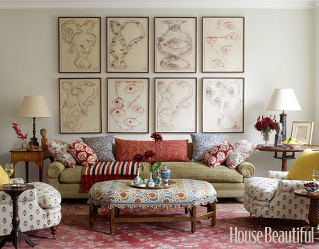
BH&G suggests moody purples with a touch of gray. Since purple can blend with various colors and warm grays tend to calm the purple down, they make a good match. For accents, throw in some citron and berry for a little brightness and fresh feel.
{Misty Lilac: benjaminmoore.com, California Dreaming: acehardware.com, Agreeable Gray: sherwin-williams.com, Tin Lizzie: olympic.com, Glazed Raspberry: behr.com}
Golden Olive + Tobacco Brown
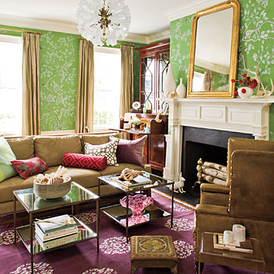
Pairing up tobacco brown and green give a space an earthy warm feel. Choosing an olive works best here. Using yellow, fuchsia and coral as accents add a touch of whimsy and brighten up the dark neutrals. These should be presented in small amounts through accessories or accent furniture.
{La Fonda Spanish Dancer: valspar.com, Straw: acehardware.com, Mona’s Mane: valspar.com, Tropical Smoothie: behr.com, Jekyll Crane Cottage Green: valspar.com}
Deep Navy + Fog Gray
This classic palette includes strong neutrals and high contrast accents. The navy is the perfect backdrop to the bright but muted fuchsia, turquoise and chartreuse. The gray keeps the palette calm and because it has blue tones it works well with the navy.
{Ruby Red: acehardware.com, Jamaican Dream: olympic.com, Savannah Moss: benjaminmoore.com, Hale Navy: benjaminmoore.com, Smoke Embers: benjaminmoore.com}


Pingback: The Spotlight: Spring Inspired Living Room | The Indigo Lattice