• About
  • Visit Gray Star Design
  • Minted Collection
  • Design Services
  • Contact

The Design Inspirationalist

~ Inspiring Ideas | Spectacular Creations

The Design Inspirationalist

Tag Archives: beige

Sound in Color: Baroness – Yellow and Green

09 Tuesday Jul 2013

Posted by melissaoconnor in Color Inspiration, Sound in Color

≈ Leave a comment

Tags

album art, artist, baroness, beige, brown, color palette, cream, earthy hues, gold, illustration, interior colors, john dyer baizley, music, palette, pink, yellow

Baroness is up again. How can I not include all their albums in these palettes? Each one is awesome. Yellow and Green is very earthy with its textured browns and golden yellows. A few pops of color help the neutrals bounce a bit as well. And as strange as the artwork seems, what beautiful line work and shading Baizley presents us. Such a super skilled and unique artist.

These soft hues are great for any interior space you want to relax in. Would be nice used in a kitchen to brighten up the space for a cheery feel or even a children’s room or bedroom for a calming, and nature inspired look.

Sound in Color: Baroness - Yellow and Green

Color in Films: Inception

12 Wednesday Jun 2013

Posted by melissaoconnor in Color in Films, Color Inspiration

≈ Leave a comment

Tags

beige, blue, brain, christopher nolan, city, color, cream, dark, dreams, earthy, films, gray, idea, Inception, mind, movie, muted, nature, palette, tones, white

Inception is one of those films you will remember forever. Not only do you feel you need to watch it a few times, you actually want to. A genius script, written and directed by Christopher Nolan, tells the in depth story of how the mind can do amazing things. The act of inception, in this case, is to implant an idea in someone’s mind but to do it in such a way that they will never know how it got there and actually feel like they thought of it themselves. A brilliant idea for a film I must say.

The cast was amazing and the effects the film explored were truly mesmerizing. The color palette was somewhat somber and city like. Dark earthy hues such as brown and gray teamed up with a scale of blues, beige, and whites for an all around smart and sharp color scheme. Anything but would not have worked. Bright and saturated choices just wouldn’t have made the proper contribution.

This film had me thrilled and entertained all the way through. Not to mention, giving my brain a workout. Superb production in my eyes. Definitely, one of the best films I had seen in a long time.

Color in Films: Inception

Decisions, Decisions

09 Tuesday Apr 2013

Posted by melissaoconnor in Art & Design, Everyday Design, Featured Artists, The Home

≈ 1 Comment

Tags

Andrew Wyeth, art, beige, Christina's World, cream, Easterly, Evening on a Marsh, field, fine art, gray, horse, interior design, light house, moon, nature, nautical, neutral, painting, Peter Sculthorpe, sky, Springhouse, white, woman

My husband and I are planning to renovate our kitchen in a few weeks and we are very close to collecting all our new pieces and materials for the space. I am so excited to finally design my dream kitchen! It will be all neutral tones, cream and white, and all the vintage pieces we have found will be painted the same color with an antique finish. The added elements will be soft plaids, grays, and rustic textures. It’s going to look gorgeous.

One of the things I am trying to decide is choosing a fine art piece for the wall across from the sink. It’t basically the only wall with nothing on it or in front of it so I thought it would be nice to feature a large piece of work in the space. Something that will really bring the room together. I know I want a nature inspired piece, preferably an open field or landscape, and one that truly resonates with what Dan and I love. I want to be able to glance at the work and not want to look away. It must be showstopper.

I’ve found a few I really like and wanted to share with my readers. I will look some more but these are very big contenders. If I don’t find anything I like more than these, they are the top choices. I want this piece to be perfect. It has to set the tone for the space and help the room feel peaceful and calm. Just the right work of art to fit with a rustic country kitchen. Decisions, decisions – what is your top pick?

Easterly by Andrew Wyeth
I have always loved Wyeth’s work. I admire the white and gray tones in this piece. Both Dan and I love nautical scenes so this is a true contender. It’s calming and ethereal which totally wins me over.
Easterly by Andrew Wyeth

Christina’s World by Andrew Wyeth
I have this exact piece printed on a postcard on my fridge so it would make sense to own a large print of it. There was something about this piece I have always been drawn to. Maybe it was the distant feeling and vast landscape or detailed strokes in the field. I love how the woman seems determined, yet hesitant to move. Her light pink dress blowing in the wind and her hair, slightly undone and natural. A true winner in my eyes.
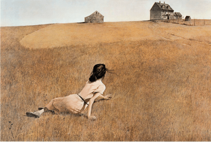
Christina's World by Andrew Wyeth

Springhouse by Peter Sculthorpe
The rustic feel of this piece really draws me in. The texture of the grass and the details of the tree, so beautiful. I love the stone structure as well as its placement in the scene. The horse is such a fascinating creature and in this painting, it truly shines in such a natural way. Imagine looking out your back door and seeing this. Amazing.
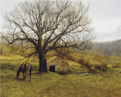
Springhouse by Peter Sculthorpe

Evening on a Marsh by Peter Sculthorpe
The serenity of this piece is what really attracted me to it. Such silence and so much life. The blues are so beautiful against the green and brown and the gold elements really bring an element of beauty as well. I love art that just goes on forever, like this one.
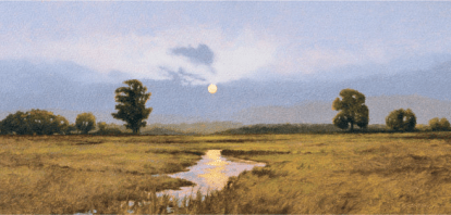
Evening on a Marsh by Peter Sculthorpe

Sound in Color: Florence & the Machine-Lungs

09 Tuesday Apr 2013

Posted by melissaoconnor in Color Inspiration, Sound in Color

≈ Leave a comment

Tags

album art, arts, beige, color, earthy hues, florence and the machine, green, illustration, lungs, mauve, music, neutrals, pink, yellow

Besides creating amazing music, Florence and the Machine grace their album covers with nature inspired artwork that seemlessly relates to their sound. I love the earthy hues this particular album showcases and how her image is incorporated into the design. There is a nice contrast to light and dark as well as a beautiful sense of how lighting helps color come alive.

Sound in Color: Florence & the Machine

← Older posts
color in films sound in color art inpsired palettes
art and design the home events and parties weddings real weddings color inspiration film-reviews historic places news and updatesminted


minted.com

Enter your email address to follow this blog and receive notifications of new posts by email.

Archives


martha

Magnolia Rouge

Screen Shot 2014-04-23 at 2.29.10 PM

Etsy

Screen Shot 2014-04-23 at 2.18.10 PM

logo

Screen Shot 2014-04-23 at 2.42.13 PM

P&PBlogHeader

wedding chicks


ruffled

Screen Shot 2014-04-23 at 2.47.49 PM

Screen Shot 2014-04-23 at 2.16.32 PM


lauren-elle-photography

jenlombardo

logo_website

site-logo1

kelly_dekenipp_logo

homelogo

Website Powered by WordPress.com.

  • Follow Following
    • The Design Inspirationalist
    • Join 1,385 other followers
    • Already have a WordPress.com account? Log in now.
    • The Design Inspirationalist
    • Customize
    • Follow Following
    • Sign up
    • Log in
    • Report this content
    • View site in Reader
    • Manage subscriptions
    • Collapse this bar
 

Loading Comments...