Usually when planning a wedding, you figure out your theme and color palette before sending out invitations, which is the best way to do it. Well, I teamed up with Wedding Paper Divas to create some colorful inspiration from a few of their wedding invitation designs. So working backwards for a moment, take a look into some beautiful invites I’ve chosen to feature and hopefully they can spark many great ideas for your own event.
{You can click on each palette to visit that particular design}
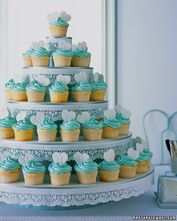
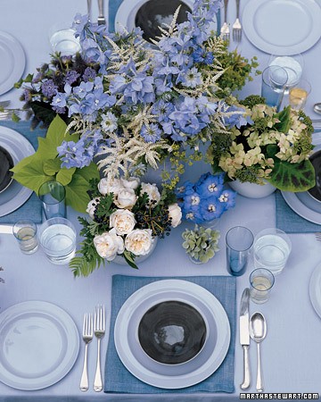
I love the rich blues and greens in this design. They are balanced with vintage neutrals of creams and browns and accented with lighter tones. The design as a whole is soft, feminine and artsy. A great inspiration for a wedding or any event.

Here are a few examples of how to use this color palette:

Photo Credit: Leboxboutique

Photo Credit: Martha Stewart Weddings

Photo Credit: Frosted Cake
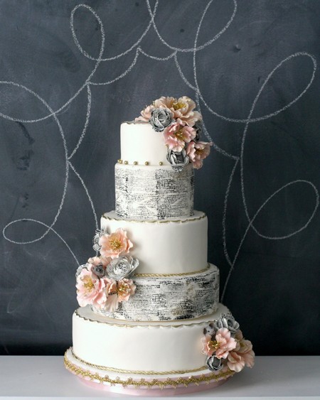
This color palette is fun and whimsy without being too childlike. The dark gray is a beautiful backdrop for spring’s soft peachy tones and with touches of mustard and white, the design stays fresh and modern.

Here are a few examples of how to use this color palette:

Photo Credit: Southern Weddings


Photo Credit: Brides
Although this palette is simple, its strong and to the point. You can take these three colors anywhere and it would be successful. The style of the invite is somewhat traditional in its text but the layout of the design is fun and cleverly organized. Mixing hard lines and flowy elements always work nicely if done right, balance is key here. The muted blue, rich brown and faded beige make a perfect trio of color inspiration.

Here are a few examples of how to use this color palette:


Photo Credit: Style Me Pretty

Photo Credit: Slice at a Time

Photo Credit: Sweet Designs
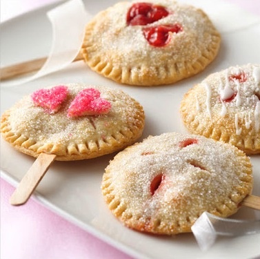
I couldn’t resist featuring this design. The colors pop and immediately scream “happy” which is appropriate for a wedding invite, for sure. The soft watercolor illustrations present the bright color palette beautifully. With different tones of pink and yellow layered like a piece of art, they really make an impression. The gray text helps balance out the design and give it weight and focus. This is a brilliant palette for a wedding.

Here are a few examples of how to use this color palette:


Not everyone loves nautical style but I certainly do. With different shades of blue that are reminiscent of the open sea and pops of red and white, this design is truly successful. You can create a beautiful ombre effect with these colors and even bring in some creams that would really make it come alive. So if red isn’t your color of choice, you can pick any other color and it would work.

Here are a few examples of how to use this color palette:

Photo Credit: Elizabeth Anne Designs

Photo Credit: The Little Canopy

Photo Credit: Martha Stewart


