• About
  • Visit Gray Star Design
  • Minted Collection
  • Design Services
  • Contact

The Design Inspirationalist

~ Inspiring Ideas | Spectacular Creations

The Design Inspirationalist

Tag Archives: light

Pause

06 Tuesday Oct 2020

Posted by melissaoconnor in life

≈ Leave a comment

Tags

homesweethome, light, nature, naturelover, sundayvibes

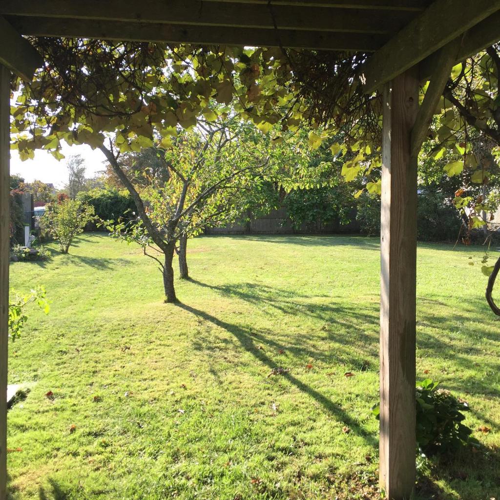
I hope you all had a great weekend. I’m been doing a great job at pausing a bit more… breathing a bit better… and honoring my time as I should. Taking in all the moments. Being grateful for where I stand. And appreciating all the beauty that surrounds me. Here’s to a productive and positive week.

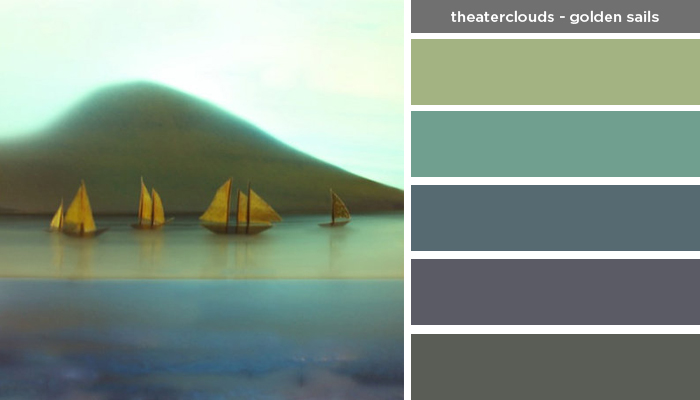
Art Inspired Palette: Theaterclouds-Golden Sails

17 Thursday Apr 2014

Posted by melissaoconnor in Art Inspired Palette, Color Inspiration

≈ Leave a comment

Tags

art, art inspired palette, boats, clouds, design, golden sails, light, mountain, nature, ocean, painting, sailboats, sails, sea, ships, theater clouds, water

Art Inspired Palette: Theaterclouds-Golden Sails

Sound in Color: Depeche Mode – Black Celebration

01 Tuesday Oct 2013

Posted by melissaoconnor in Color Inspiration, Sound in Color

≈ Leave a comment

Tags

80s, 80s music, A Question of Time, album art, Black Celebration, building, collage, color, color palette, cover art, Dave Gahan, Depeche Mode, light, music, New Dress, palette, Question of Lust, shadow, Stripped

I have liked Depeche Mode for many years now. Although they formed a year after I was born I connected with their music and listened to it throughout my life. Vocalist, Dave Gahan, possesses such an interesting and unique voice that nobody can match and even though they are considered an electronic band, they incorporate so many other beautiful elements in their sound.

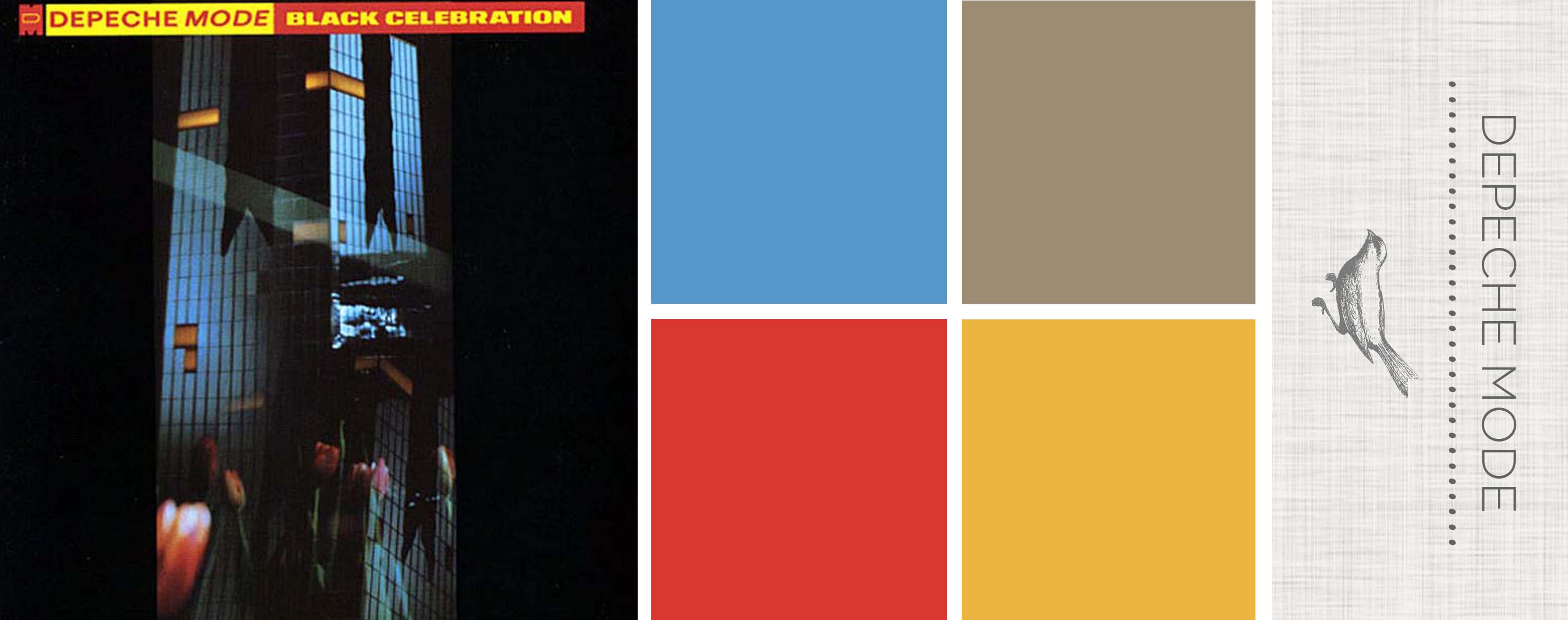
Their 1986 album, Black Celebration, was a slightly different tune than their previous music. With somewhat of a darker spin, this fifth album consisted of fantasy driven sounds with an edge that carries a bit of sadness we can all connect with. On the other hand, the somewhat gloomy lyrics are paired with bright pops of synth genius which really helps the songs to shine. I can remember listening to this album while I was a teenager. My favorite tracks are Black Celebration, Question of Lust, A Question of Time, Stripped, and New Dress. Today when I listen to it, boy does it take me back.

The album art is a good fit for the sound of this album. It’s dark and unusual with pops of color and of course has an 80s feel to it. The image of a city building is used as a backdrop to showcase part of their logo, upside down M, and projected tulips. I like how the whole piece has a collage styled look while also highlighting shadow and light in the imagery. All in all, a good representation of the music on the album.

{ This post is dedicated to my best friend Heather who is the biggest Depeche Mode fan I know. One can say she is a little obsessed ♥ }
Sound in Color: Depeche Mode - Black Celebration

Sound in Color: Aphex Twin – Selected Ambient Works Volume II

20 Tuesday Aug 2013

Posted by melissaoconnor in Color Inspiration, Sound in Color

≈ Leave a comment

Tags

album art, ambient, Aphex Twin, brown, color, color palette, grunge, light, music, orange, palette, red, Selected Ambient Works Volume II, shadow, texture, tone, warm hues, yellow

Aphex Twin was a big part of my youth. As I got older his music played roles in special memories of mine, ones I would never forget. When certain sounds find their way into your life and act as a soundtrack, you know its good. This is just one of albums that I really connected with. Just the light, airy sounds and unique combination of ambient beats took me to another place. There surely is no other to compare to Aphex Twin.

The album artwork is grungy and distorted, with the color of rust the main character. The play with light really creates a beautiful array of tone and shadow, while it goes from cream to orange and then to brown. And with the texture these colors display behind it, you just wish you could feel its beauty.

This is a nice palette to take in consideration when using warm hues in your home or event. Orange has so many shades, from tangerine to the carrot color we all know, and you can find a lot of them here. The same with yellow and brown, which also incorporates the red family. A whole lot of warmth resonates from this album, both inside and out.

Sound in Color: Aphex Twin - Selected Ambient Works Volume II

← Older posts
color in films sound in color art inpsired palettes
art and design the home events and parties weddings real weddings color inspiration film-reviews historic places news and updatesminted


minted.com

Enter your email address to follow this blog and receive notifications of new posts by email.

Archives


martha

Magnolia Rouge

Screen Shot 2014-04-23 at 2.29.10 PM

Etsy

Screen Shot 2014-04-23 at 2.18.10 PM

logo

Screen Shot 2014-04-23 at 2.42.13 PM

P&PBlogHeader

wedding chicks


ruffled

Screen Shot 2014-04-23 at 2.47.49 PM

Screen Shot 2014-04-23 at 2.16.32 PM


lauren-elle-photography

jenlombardo

logo_website

site-logo1

kelly_dekenipp_logo

homelogo

Website Powered by WordPress.com.

  • Follow Following
    • The Design Inspirationalist
    • Join 1,707 other followers
    • Already have a WordPress.com account? Log in now.
    • The Design Inspirationalist
    • Customize
    • Follow Following
    • Sign up
    • Log in
    • Report this content
    • View site in Reader
    • Manage subscriptions
    • Collapse this bar
 

Loading Comments...