• About
  • Visit Gray Star Design
  • Minted Collection
  • Design Services
  • Contact

The Design Inspirationalist

~ Inspiring Ideas | Spectacular Creations

The Design Inspirationalist

Tag Archives: red

Color in Films: The Village

26 Wednesday Jun 2013

Posted by melissaoconnor in Color in Films, Color Inspiration

≈ Leave a comment

Tags

children, color palette, colors, earth, forest, green, hues, lesson, life, love, M. Night Shyamalan, monsters, moss green, nature, new england, Pennsylvania, red, tale, the village, trees, village, wicked, woods, yellow

I am a big fan of M. Night Shyamalan, always was and always will be. I think he is such a great storyteller. He brings a true sentimental touch to the screen that leaves you thinking much more than when you started. The Village is one of those films. One of my favorites from his collection, its a tale of protection, fear, and love. With beautiful cinematography, flawless set and art direction, and an amazing group of actors, The Village explores the boundaries of good and evil and true love.

The film takes place in a small Pennsylvania village cut off from the rest of the world. The elders have built it to protect their children from the “wicked”. There are known monsters that live beyond the village and because of this watch towers and barriers of oil lanterns have been constructed for their protection. The time is 1987 but the villagers live an Amish lifestyle, no electricity and a simple way of living.

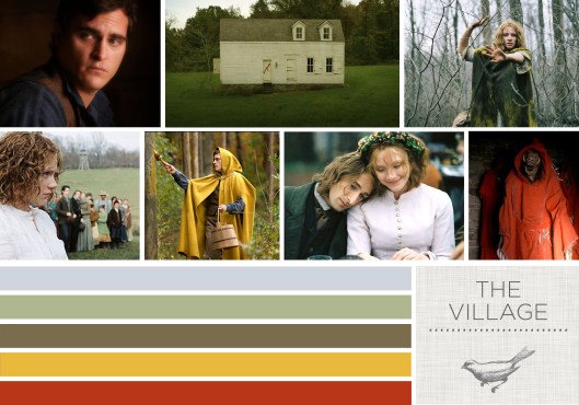
The main couple, Lucias and Ivy, express their love for each other and plan to soon marry. When a young boy dies and Lucias asks to go into “the towns” for medicine, he is denied. However, he ventures out anyway. The color red is used throughout the film as the bad color, and is seen on doors & shown through flowers when the monsters are near. Red cloaks also cloth their bodies. While he is away, the village has a visit from these beings and it startles everyone into a frenzy. A few days after Lucias gets back, he sadly gets stabbed by another man, Noah, in the village, who loves the girl as well. Unfortunately, he has developmental issues and doesn’t truly realize what he has done.

In order to help Lucias, Ivy gets ready for her trip to the towns for medicine. Although she is blind, she is strong willed and eventually makes it back with the items she needs. The journey through the woods is one of terror and truimph, as she comes across one of the monsters and defeats it. But there is a major secret in the village that unfolds through the film and in the end another life is lost because of it.

Told through the colors of nature and New England beauty, The Village is a remarkable tale filled with lessons on life and love. From the mossy greens and earthy browns to the pops of yellow and red, the backdrop of the woods truly allows for a peaceful, yet haunting feel. There are scenes that will surely win you over and ones that will startle your inner being. Another great story with a message that will continue to be relevant as the years go by.
Color in Films: The Village


Sound in Color: Sonic Youth – Dirty

25 Tuesday Jun 2013

Posted by melissaoconnor in Color Inspiration, Sound in Color

≈ Leave a comment

Tags

album, blue, color palette, colors, dirty, gray, grunge, hues, music, orange, red, sonic youth

I have loved Sonic Youth since back in the day when I was a teenager. There was something unique about their sound I was really attracted too. The angst that flowed through their music was a huge contribution to the 90s grunge scene, where they picked up a whole new generation of fans. This girl was surely one of them.

The NY based band has been around since the early 80s and have been the frontrunners of their time. Staying true to their underground sound and noise rock style, they have evolved into a group that truly grows within the industry. Their album Dirty, released in 1992, was their ninth production and one of my favorites. It featured art by Mike Kelley, which appealed to me the first time I saw it. How can you resist a cover with a portrait of a cute stuffed animal?

The color palette is fairly simple but ranges in tone. The warm hues of orange and red make a nice contrast to the light blue and cool gray created in the shadows. It almost has a vintage feel and if used right, this combination could successfully create that style in a space. You could take the blue and gray and design an earthy, feminine palette or go with the hotter colors and take it up a notch. This album surely offers a great amount of inspiration.

Sound in Color: Sonic Youth - Dirty

Choosing the Right Colors for the Rooms of Your Home

06 Thursday Jun 2013

Posted by melissaoconnor in Color Inspiration, Everyday Design, Guest Posts, The Home

≈ Leave a comment

Tags

bedroom, blue, color advice, colors, cream, design, dining room, earthy tones, exercise room, gray, home, kitchen, living room, neutral, office, orange, red, white, yoga space

When choosing to paint a room in the house it is best to strive for a color you like, but also a color that likes you. Color can have subtle, yet profound, influences on moods and feelings, and recognizing that can help a room to be aesthetically pleasing as well as beneficial. The correct colors in a kitchen or art room can help inspire creativity while the wrong colors in a bedroom can induce irritability when relaxation is being sought. Below are different types of rooms commonly found within a household, and which colors would best compliment them.

Living Rooms
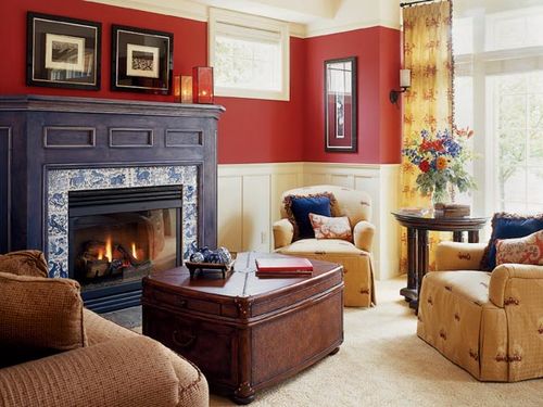
Homeowners use living rooms for a number of different things. Some use the larger rooms for hosting guests and parties, but generally living rooms are used for relaxing. Colors for living rooms should be neutral to help accent furniture, but also light and calming.

Choosing the Right Colors for the Rooms of Your Home
Photo Credit: Digs Digs

Orange instills feelings of warmth and stability and manages to tone-down a space, allowing people to relax. Red is good for sociable situations, as it provides energy. Light gray is very popular for living rooms right now as it compliments other colors very well and is not overbearing. A primarily gray room with orange accents could provide the perfect tones for a living room.

Choosing the Right Colors for the Rooms of Your Home
Photo Credit: Real Simple

Choosing the Right Colors for the Rooms of Your Home
Photo Credit: Color Buzz

Choosing the Right Colors for the Rooms of Your Home
Photo Credit: Decoist

Kitchens
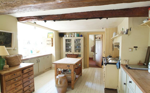
Kitchens are difficult to figure out as they are rarely used for one activity. Modern kitchens are used for cooking, eating, meeting, crafts, and many other activities. However, creativity usually happens in the kitchen, whether it’s from cooking, conversation, or something else. Soft earth tones like whites, creams, and blues, cater to a number of needs and puts people at ease, allowing creative juices to flow. Bright elements like red or orange are good accents as well.

Choosing the Right Colors for the Rooms of Your Home
Photo Credit: Katy Elliott

Choosing the Right Colors for the Rooms of Your Home
Photo Credit: Cottage Modern

Choosing the Right Colors for the Rooms of Your Home
Photo Credit: Aponovich

Dining Rooms
Modern dining rooms are rarely used by the average family, and are typically only sat in when guests visit. Therefore, a dining room should encourage energy and liveliness, and red is the best color for this. Too much red can have negative effects though and can promote aggression, so a balance is desired with a softer color.

Choosing the Right Colors for the Rooms of Your Home
Photo Credit: Allrakse

Bedrooms
These rooms should ultimately reflect the individual living in them, but some types of colors serve to help promote calming emotions. Light blues are great for this and people generally feel safer and calmer when surrounded by them. Turning to a dark blue can have negative effects, however, as it can produce sadness in individuals.

Choosing the Right Colors for the Rooms of Your Home
Photo Credit: Weekend Escapades

Exercise Spaces
Power lifters and those going for hard workouts will want red highlights throughout their room to inspire energy and controlled aggression, but those looking to jog on an elliptical or relax with yoga will want earthy greens and blues to help calm and extend the workout.

Choosing the Right Colors for the Rooms of Your Home
Photo Credit: A Charmed Yogi

Home Offices
In a room where people need to focus and avoid distraction green is the way to go. This color has been found to promote concentration and productivity and workers. Plus, it is also a soothing color which helps relieves stress.

Choosing the Right Colors for the Rooms of Your Home
Photo Credit: Virtual Vocations

Choosing the Right Colors for the Rooms of Your Home
Photo Credit: Studio Rover

Even if a color has great potential to influence moods in a positive manner it may not be worth it if the color is unpleasing to the residence or causes the room to appear small. Whatever the case, it is worth realizing that color choice is much more important than many people realize.

Lisa Henfield is an exterior designer who spent a few years designing outdoor furniture covers for hotels along Las Vegas. She mostly writes about her design experiences, providing tips on outdoor accessories and furniture for both businesses and the average person. When she isn’t practicing her sewing or writing about the right colors for the outdoor seasons she usually works on her paintings.

Sound in Color: The Kills – Midnight Boom

04 Tuesday Jun 2013

Posted by melissaoconnor in Color Inspiration, Sound in Color

≈ Leave a comment

Tags

Alison Mosshart, bed, childlike, color, color palette, events, guitar, Jamie Hince, light blue, midnight boom, music, palette, parties, pastels, pink, purple, raw, red, sound, the kills, wedding

The Kills are such a great band. I love how with just two people, the band can create awesome music that is catchy, unique, and raw. Seeing them live was seriously one of the best shows I have ever been too. They were so good.

This particular album is one of my favorites. I love the gritty sound against Alison Mosshart’s serene voice. The photo on the cover brings me back to my teen years, just hanging in my room playing guitar. It’s interesting because it does have some nice colors in it, but you don’t really notice them to much. In a way, they sort of contradict the artists in the band and their music. They are fun and childlike, and would be successful if used in any type of party for a child or even a wedding.

The Kills - Midnight Boom

← Older posts
Newer posts →
color in films sound in color art inpsired palettes
art and design the home events and parties weddings real weddings color inspiration film-reviews historic places news and updatesminted


minted.com

Enter your email address to follow this blog and receive notifications of new posts by email.

Archives


martha

Magnolia Rouge

Screen Shot 2014-04-23 at 2.29.10 PM

Etsy

Screen Shot 2014-04-23 at 2.18.10 PM

logo

Screen Shot 2014-04-23 at 2.42.13 PM

P&PBlogHeader

wedding chicks


ruffled

Screen Shot 2014-04-23 at 2.47.49 PM

Screen Shot 2014-04-23 at 2.16.32 PM


lauren-elle-photography

jenlombardo

logo_website

site-logo1

kelly_dekenipp_logo

homelogo

Website Powered by WordPress.com.

Privacy & Cookies: This site uses cookies. By continuing to use this website, you agree to their use.
To find out more, including how to control cookies, see here: Cookie Policy
  • Subscribe Subscribed
    • The Design Inspirationalist
    • Join 1,380 other subscribers
    • Already have a WordPress.com account? Log in now.
    • The Design Inspirationalist
    • Subscribe Subscribed
    • Sign up
    • Log in
    • Report this content
    • View site in Reader
    • Manage subscriptions
    • Collapse this bar
 

Loading Comments...