Wedding invites are supposed to be one of the fun things about planning a wedding. Along with the save the dates, they allow your guests to take a sneak peak into your special day and help build anticipation to attend. Personally, I think they are one of the most important pieces in tying your theme together and really should make sense when it comes to your wedding’s decor.
Although everyone has different tastes and styles, I think we can all agree that getting an invitation in the mail for an event, whatever it may be, is exciting excited. Being a designer, I get all happy just to see how they are designed. I can’t help analyzing its elements and typography and grade how it’s all put together. Using my inside voice of course. And yes, a lot of the time I find a few things I would have done differently. All the more reason I am in the design field. Alas, not everyone has a keen eye for design
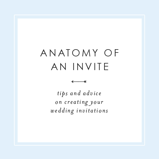
Since I am launching new designs in my Etsy shop, most of which will be for events such as weddings, I thought it was fitting to write a post on the anatomy of an invite ,and include some extras, to share what to include and how to showcase different elements. The main thing to remember is the final piece should represent your event and have a cohesive look. I decided to use mine as a reference so lets get started!
First, you should treat the envelopes will care just as much as you do with the invite. Think of it as the door people will open before they step inside your home. You want it to be clean and beautiful showcasing your guests name in decorative type on nice paper. Featuring special stamps surely add a nice touch. And there are a bunch of different types of packaging you can use as well so don’t feel you have to settle for an basic envelope. Basically, you don’t want it to look like an everyday piece of mail.
The thing to look out for, and this is a no no for sure in my book, is using a font or handwriting that people can’t read. Whether you are having calligraphy done or choosing to print the names and addresses, its important that the mail carriers and your guests can read it. I think this is probably where a lot of people go wrong. They want a fancy looking envelope but just go a little too far. If the designer who worked with them felt it was good to go, then I question their typography skills.

I chose to use the font featured on our invites so they would match. Plus, I am in love with the one I used, so pretty and organic. The envelopes were textured recycled taupe which was made sense since our day represented a natural style and eco-friendly feel. The vintage floral stamps purchased on Etsy really brought the whole thing together. I bought all different ones so not all the invites were the same and also mixed in some recent stamps to mix it up.
For the back we used a custom stamp we had made with our names and address. Just from the envelope alone, one can clearly see our wedding day was going to be nature inspired and peaceful, which is was.

The invites were 2 pieces of recycled sand speckled paper that I joined together by a little button clasp in the top left corner. It was important to me to use earth friendly materials and have an overall natural vintage look. Since our wedding was on a farm held during a Sunday afternoon, I also made sure the invite carried a soft and light style to mirror daylight as apposed to a fancier evening wedding.


The front piece was created with various patterns and digital stitching to look like a quilt. I used a needlepoint font that stayed within that feel and included the two other fonts I used for the info piece. So in total I chose three fonts for the invite which I used throughout all the decor for the wedding. This kept the theme cohesive and helped all the decor flow with each other.
The addition of the key represents the vintage key Dan gave me on our anniversary before we were engaged. It opened the small treasure chest I would eventually be given on the night he proposed. It’s little things like this that make an invite really special. Heartfelt and personal, this tiny key is a gesture of our engagement.

The inside piece included all the information our guests would need to know about our wedding day. I wanted the text to show our love for the Earth and animals and including small decorative illustrations of natural elements helped carry along that message. I used two fonts and laid them out so the invite was easy to read as well as interesting. Playing with typography is one of my favorite things to do and I feel that clearly shows in the invites. The addition of the blue lace was also used on other decor and was introduced here for that reason.
Since it was a casual spring wedding, we let people know the dress code with a little poem, Let Spring Inspire Your Attire, hoping they understand that suits and formal gowns were definitely not fit for the day. And to stick with our eco-friendly theme, we chose to use an online RSVP instead which could be found on our wedding blog. From the invites alone, Dan and I were represented well. One can see that our wedding was truly about us and not just having an event to have it.

I also included directions so everyone would know how to get to the venue, along with the contact information. I was happy to get positive responses from guests about how nice the invites looked. It made me happy to know that all my hard work paid off. Having done all the design work for the event, it got stressful at times. Especially, since we had just bought a house less than 3 months before. But in the end, I am happy I pulled it off and learned from the experience.

Here are some of the other items I designed for our special day. I created the table numbers to match the invite, you can now purchase these at my Etsy shop and instead of seating cards I decided to go with seating charts to save paper. I hung these on linen ribbon between two vintage shovels at the entrance. Notice how they all flow nicely with each other and fit into our theme.


And for the pre-wedding items like the save the dates, wedding site and bridal shower invites, I tried to have them represent the same style but show different elements. Dan and I threw our engagement party for friends at our old apartment and didn’t want it to be a big deal. So for that I saved trees and sent everyone an evite. You can see more about the party in my post, Decorating Your Way to a Great Party.
The save the dates I designed as a vintage postcard which featured one of our photos from the engagement shoot on the front. It also included our wedding site info so our guests could look into the details of our special day. Since they were 4×6 postcards, we were able to save a little money on the postage as well.

Our wedding site was a blog I put together to showcase all the things our guests could look forward to on our wedding day. Besides info on the all vegetarian menu, I included a bio on our dj, photographer, videographer and officiant. Most of all were friends and people we knew. I made sure to share the story of how Dan and I met with updates on our lives as well as our engagement story. People could also find our registry and RSVP on the site too. Everyone in one place!

I opted to take a break and purchase the bridal shower invites instead of designing them. I know its tradition to have it be a surprise but in my case it made more sense to know about it and help with the planning. Both my Mother and maid of honor, Meg, live in New Jersey so to make it easier on everyone I just had the shower at my house. Since we just moved in a few months earlier it was nice to have everyone over to check it out, especially since we didn’t have a house warming party.

I wanted the invite to showcase pastels being it was April and I loved the fun and modern feel of the Jolie design on Minted so I went with that. I liked the bonsai stamps because they included nature and for the envelope info I printed a casual but pretty font on the front. I chose April 22nd, which was Earth Day, so it truly would be a nod to what I love. The day turned out very nice and I was so happy to hang with all the ladies in my life. Here are a few photos from the day:


I had such a great experience during the wedding planning process. Having put together so much myself is really an accomplishment and I am pleased with how it all turned out. I am sure you can understand the excitement I feel knowing I can help others with their special events whether it be through design or planning, especially since I just went through the whole process myself. I look forward to doing business with other couples and really make their “dream” day come true.