Tags
antique, black, black and white, blue, ceremony, city chic, classy, color, country, decor, events, flowers, gray, monochrome, Monochrome Wedding Palettes, nautical, palettes, pastels, pink, reception, shabby chic, vintage, weddings, white
There are endless possibilities to colors and decor for your wedding. It’s all a matter of what you love and your taste profile. I think people mostly pick their color scheme first and move forward from there, which isn’t a bad way to go. I always say, choose your theme first and then everything should fall into place. But you can have so much fun with color, for sure.
What if you just chose one color for your special day? It may seem boring to some and maybe even strange to most, but having a monochrome palette could be very pretty if its done right. Now, just because you are using one color, that doesn’t mean your wedding will be an abundance of black or overwhelming amount of pink. You have to look beyond the color wheel and go deeper in the color you have chosen to use. By showcasing different tones and shades and playing with texture, you could have a gorgeous array of monochrome bliss.
Here are some great examples and inspiration of successful monochrome weddings. Hopefully, it will help broaden your understanding of this palette style and allow you to have fun with all the possibilities.
White
With an all white wedding, you can play with soft hues and pale tones. There are many variations of this color, you just need to explore the possibilities. This palette can be romantic, luxurious, country, city chic, vintage & antique, shabby chic and more, depending on your theme.

Photo Credit: Hairstyles and Fashion

Photo Credit: Kelly Prizel

Photo Credit: Momental Designs

Photo Credit: Belle the Magazine

Photo Credit: Four Seasons
Pink
An all pink wedding can be tricky but it can be done. Play with the lighter hues of this color, pastels work well together when they are in the same family. If you decide to go with a deeper or brighter shade of pink, just use it for pops here and there or it can overpower the event. You could make pink work for a modern wedding and also a more vintage style wedding.

Photo Credit: Event Decorator

Photo Credit: My Married

Photo Credit: Elizabeth Anne Designs

Photo Credit: Weddings by Lily
Blue
The color blue works with a lot of theme and its easy to incorporate. There are so many pretty shades of it too. Whether its a nautical style wedding you are planning or a spring event, blue will definitely add class to the overall style.

Photo Credit: BrideoRama

Photo Credit: Celebrations at Home

Photo Credit: Karen Tran Florals

Photo Credit: Bold by Design
Green
Using green is super easy if you are having a nature inspired event. Your venue, if outside, can act as the main decor and all you need to incorporate are elements within your theme and palette. I would stray from using Crayola tones and stick with more natural moss, lime and pastels.

Photo Credit: Wedding Flowers

Photo Credit: JL Designs

Photo Credit: Burnett’s Boards

Photo Credit: Marriage Reception Ideas
Black
Having an all black wedding is a tough one. There have to be white elements thrown in here and there to break up the dark color or your guests will feel like they are at a night club or goth party! If that is what you are going for, than feel free, but I think most wedding decor is not going in that direction. Use various shades of black, gray tones could be really nice and classic. If done right, it can all look very chic and grand.

Photo Credit: Gudu Ngiseng

Photo Credit: Weddingomania

Photo Credit: Plectrumbanjo

Photo Credit: Brides
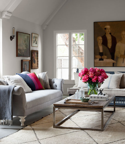
Gray
This color can be used so many ways. Gray is a beautiful hue that can easily represent many styles. It’s classic and vintage at the same time.

Photo Credit: The Sweetest Occasion

Photo Credit: Scarlet Petal

Photo Credit: Somersault Vintage

Photo Credit: Preston Bailey