• About
  • Visit Gray Star Design
  • Minted Collection
  • Design Services
  • Contact

The Design Inspirationalist

~ Inspiring Ideas | Spectacular Creations

The Design Inspirationalist

Tag Archives: neutrals

Color in Films: Pan’s Labyrinth

01 Wednesday Aug 2012

Posted by melissaoconnor in Color in Films, Color Inspiration

≈ 1 Comment

Tags

childhood, color, creatures, dark, emotional, fantasy, film, guillermo del toro, labrynth, neutrals, pans labrynth, spain, underworld

It’s been awhile since I posted a new Color in Films palette so I am excited to share one with with you all today. I have redesigned the layout and given the palettes a fresh new look. As of now, they are also exclusive to The Design Inspirationalist and will only be seen here. I hope you enjoy my first palette in a long time as much as I do. Enjoy!

Written and directed by one of my favorite filmmakers, Guillermo del Toro, the story of Pan’s Labyrinth is set in 1944 during the Francoist period in Spain. The main character, Ofelia, is the daughter of a Falangist Captain who discovers a labyrinth that introduces her to many strange but magical creatures. The film joins her fantastical journey in this overgrown world with the real world where her mother is ill and getting worse.

This film is an amazing story of strength, wonderment, childhood and fantasy. The main creature whom Ofelia interacts with gives her three tasks to complete. As the story unfolds sadness takes over with a number of devastating events happening towards the end, both resulting in death. However, a happy ending awaits with Ofelia living on in the underworld with all the creatures of the labyrinth where she is forever free.

The color scheme of the film is dark and cold which reflects greatly on the premise of the story. You will find earthy hues and subtle shimmer that will lead you along a unique and emotional path that is reminiscent of the Secret Garden with a more mature tone. Escape into a world where anything is possible and the unknown is for all to see. Pan’s Labyrinth will surely take you for a ride.

Color in Films: Pans Labyrinth

Nautical Newsies

01 Sunday Jul 2012

Posted by melissaoconnor in Shop Gray Star Design

≈ Leave a comment

Tags

classic, etsy, gifts, gold, gray star design, neutrals, notecards, ocean, pink, sea, seashels, silver dollar, stationary, yellow

Here are two new additions to my Etsy shop, my nautical notecards featuring vintage illustrations of beauties of the sea. Hope you love them just as much as I do!

Nautical Newsies - Silver Dollar Notecards

Nautical Newsies - Yellow Seashell Notecards

Coastal Cottage

19 Tuesday Jun 2012

Posted by melissaoconnor in Everyday Design, The Home

≈ Leave a comment

Tags

antique, beach, blue, botanicals, coastal, color, cottage, decor, decorating, design, flowers, gray, green, interior design, ivory, lavender, nature, nautical, neutrals, pastels, pink, plaid, purple, rustic, shabby chic, style, texture, vintage, weathered, wood, yellow

Coastal Cottage

Summer brings the warm sun and nature’s beautiful colors. It also brings a breathe of fresh air to a lot of people who love the heat so beaches, parks and lakes are most popular during this season. I personally love beaches, just not in the summer. I always thought the cooler months really brought out the beauty in coastal scenery. When its hot, some of the personality that clear skies and cool breezes brings out in the water and the surroundings is just hidden.

When I think of the water and the vast sea, usually the first thing that comes to mind is relaxation and a calmness. The bluest of nature is the star. When I think of some styles of decor, there is only one that comes to mind that I feel is comfy, soothing and natural as nature and nautical surroundings. That is surely cottage style.

It’s not surprise I love this style. Not only do I represent it in every room of my home it clearly is showcased in a lot of my design work as well. Over the years I have grown to love this style with all my heart. It is where I feel most calm. So I combined my two loves into a style Mother Nature would love herself – Coastal Cottage. Such a great combination.

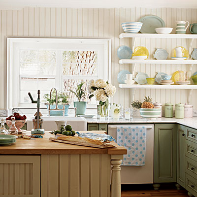
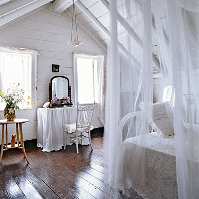
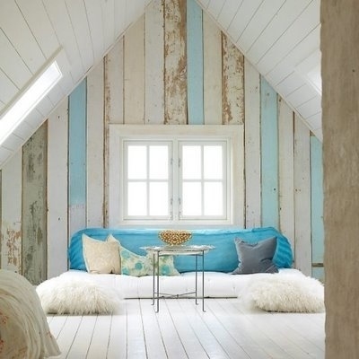
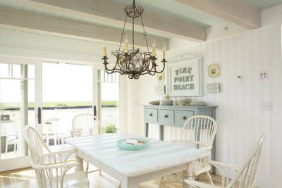
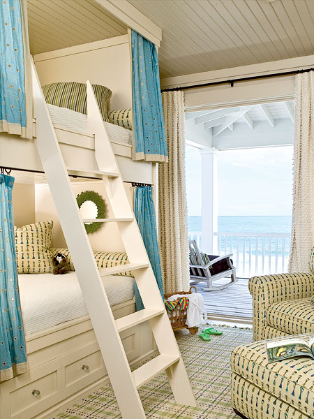
To successfully create this style in your home there are a few things to remember. When you are choosing colors, let nature lead the way. Pastel blues, greens, pink and purples are just a few of the many hues that are popular. A sunny yellow in the kitchen, a lavender in the bedroom and a blue inspired by dusk for the living room are just a few examples. Always include darker tones that are inspired from nature to help weigh down the space such as warm browns and cool grays. These all help to maintain a peaceful environment.

Coastal Cottage Colors

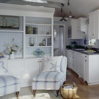
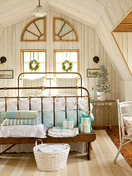
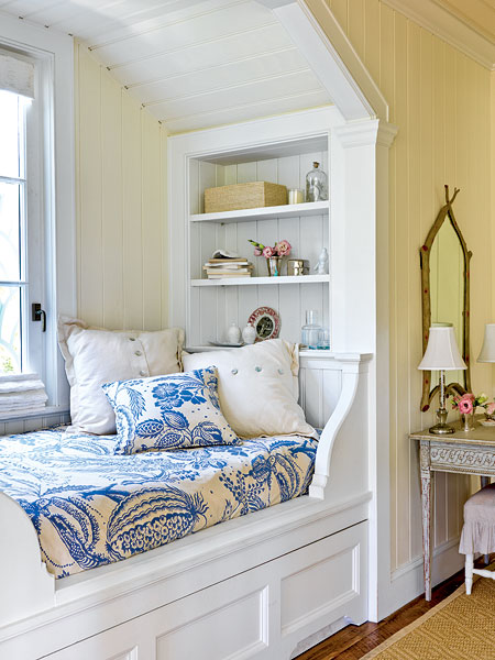
When deciding on furniture, look for unique pieces that tell a story. Vintage finds play the perfect role in a cottage style space. Warm woods, soft and comfy cushions, patterns and subtle texture; these all help bring the style together. You want your pieces to feel weathered and rustic while showing craftmanship and strength. This allows them to bring character and personality to the space and help it feel lived in and comfortable.

Coastal Cottage

Coastal Cottage

Coastal Cottage

Coastal Cottage

Accessories are very important because they allow for a cohesive design and help bring your personality to the table. You want them to feel handpicked and important. Textiles such as curtains, tablecloths, blankets and upholstery are key elements here. By showcasing plaids, stripes and botanical prints the cottage style will come alive. Don’t forget to include plants of all types. They will add that natural touch every style needs.

Coastal Cottage

Coastal Cottage

Coastal Cottage

Coastal Cottage

Coastal Cottage

Coastal Cottage

Coastal Cottage

Be careful about bringing too much nautical in because you don’t want the room to feel like you are the captain of a ship or the preppy kids took over. If so, you can kiss the cottage mix goodbye. You also want to watch the colors you add to the space because using too many reds, blues and greens may bring in that Americana feel. And although that is somewhat incorporated into the cottage style, its not the star. It can easily overwhelm the space and give it a completely different look.

And for all the fun details in between, have fun and make it yours. These next few photos are great examples of this style. Get inspired by this unique look and let it fill your heart with glee. I do everyday.

Coastal Cottage

Coastal Cottage

Coastal Cottage

Coastal Cottage

Coastal Cottage

Coastal Cottage

Coastal Cottage

Coastal Cottage

Coastal Cottage

Coastal Cottage

Coastal Cottage

Coastal Cottage

Coastal Cottage

Coastal Cottage

Coastal Cottage

Coastal Cottage

Coastal Cottage

Coastal Cottage

Coastal Cottage

Coastal Cottage

Coastal Cottage

Coastal Cottage

Coastal Cottage

Coastal Cottage

Art Inspired Palette: Jayme McGowan

02 Wednesday May 2012

Posted by melissaoconnor in Art Inspired Palette

≈ Leave a comment

Tags

animals, beige, blue, fantastic mr fox, foxes, gray, green, jayme mcgowan, neutrals, paper, pastels, pink, roadside projects, skunk, tan

I am sure you all know I absolutely love paper. If you don’t than where have you been? You can check out my Pinterest board, My Love Affair for Paper, to see why if you haven’t already. But now I have to talk about paper artist and illustrator Jayme McGowan. She has taken the craft to new heights with her 3D dioramas and I must say, I am a huge fan.

Jayme lives and works in Sacramento, California where she creates wonderful little imaginary scenes we all would like to travel to. She illustrates unique characters then brings them to life. The final product are hand cut creatures so lovable, you wish you could be transformed as well.

You can find her work at her Etsy shop, Roadside Projects, where 5×7 and 8×10 prints are available. The piece I chose for the palette spoke to me through form, personality and most of all color. From the pastel blues and pinks to the neutral gray tones, I just couldn’t resist. I also love the addition of pattern and detail, which you will find in all of her work. Like I said before, Jayme takes the craft to new heights.

Look to her work for inspiration that brings a unique and whimsy feel to any event or space. Her talent for creating movement and emotion will certainly impress you, as it did for me. I recommend you check out all her work and maybe even send a little “hello, you rock”. You can read more about her process and the latest news on her blog and don’t forget to like her Facebook page too.

Art Inspired Palette: Jayme Mcgowan

← Older posts
Newer posts →
color in films sound in color art inpsired palettes
art and design the home events and parties weddings real weddings color inspiration film-reviews historic places news and updatesminted


minted.com

Enter your email address to follow this blog and receive notifications of new posts by email.

Archives


martha

Magnolia Rouge

Screen Shot 2014-04-23 at 2.29.10 PM

Etsy

Screen Shot 2014-04-23 at 2.18.10 PM

logo

Screen Shot 2014-04-23 at 2.42.13 PM

P&PBlogHeader

wedding chicks


ruffled

Screen Shot 2014-04-23 at 2.47.49 PM

Screen Shot 2014-04-23 at 2.16.32 PM


lauren-elle-photography

jenlombardo

logo_website

site-logo1

kelly_dekenipp_logo

homelogo

Website Powered by WordPress.com.

Privacy & Cookies: This site uses cookies. By continuing to use this website, you agree to their use.
To find out more, including how to control cookies, see here: Cookie Policy
  • Subscribe Subscribed
    • The Design Inspirationalist
    • Join 1,379 other subscribers
    • Already have a WordPress.com account? Log in now.
    • The Design Inspirationalist
    • Subscribe Subscribed
    • Sign up
    • Log in
    • Report this content
    • View site in Reader
    • Manage subscriptions
    • Collapse this bar
 

Loading Comments...