• About
  • Visit Gray Star Design
  • Minted Collection
  • Design Services
  • Contact

The Design Inspirationalist

~ Inspiring Ideas | Spectacular Creations

The Design Inspirationalist

Tag Archives: blues

Sound in Color: Mono – Formica Blues

17 Tuesday Sep 2013

Posted by melissaoconnor in Color Inspiration, Sound in Color

≈ Leave a comment

Tags

album art, art, blues, collage, color, color palette, contemporary, electronic, fine art, formica blues, hues, jazz, modern, mono, painting, romantic, Siobhan de Mare, trip hop, UK

UK band Mono creates beautiful music that is an eclectic combination of jazz, blues, and electronic sounds. Their 1997 album, Formica Blues, is a great piece to play when you are relaxing or working as well as entertaining. Their sound is reminiscent of the Sneaker Pimps, Massive Attack, and Portishead with a more classical feel. Siobhan de Mare sang lead on this one, which brings such a romantic and bluesy touch. My favorite song on the album is Playboys, such a great track.

The album art is colorful and modern with a collage style. The lines are unexpected and the mix of paint, imagery, and texture play very well with the sound of the album. And although the hues are rather elementary, they are used in a way that is contemporary and interesting. It’s cool when a bands album cover can also be hung from your wall. This one can for sure.

Mono-Formica Blues

Home Sweet Home: Living Room Redesign

09 Monday Apr 2012

Posted by melissaoconnor in Everyday Design, The Home

≈ Leave a comment

Tags

blues, brown, gray, home, interior, living room, neutrals, redesign, white

This is the second post for my Home Sweet Home series. If you haven’t checked out the last one, you can read it here. This time I will sharing our final design for the living room of our new home. I love how the space came out and am very excited to show it to you all. Transforming the room took a series of steps and even though it was hard work, it all paid off in the end.

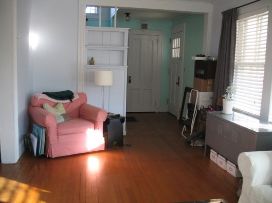
Here is what the living room looked like before. It was dingy, musty and the beautiful characteristics were almost unseen.

Home Sweet Home: Living Room Redesign

Home Sweet Home: Living Room Redesign

Home Sweet Home: Living Room Redesign

The first step was to take the rugs up. Dan gets all the credit for this one. He took up all the rugs in the house by himself! Once they were up, the room was able to finally breathe.

Home Sweet Home: Living Room Redesign

The second step was the painting. The main issue we had was the walls. The previous owners liked to add layer upon layer which was a pattern we saw throughout the whole house. So, underneath the paint was wallpaper. Because of this, the walls were cracking and peeling. Since we didn’t have the funds to replace the walls, I used textured paint and went over the bad spots to make them even. It didn’t come out 100% but it certainly helped.

You can see the worst spot in the room to the right of Danny. What were these people thinking!

Home Sweet Home: Living Room Redesign

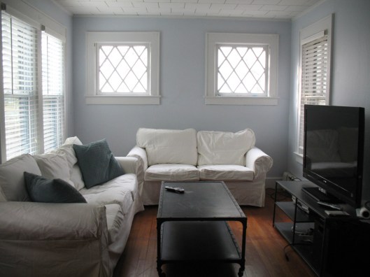
After the walls and moulding were painted, the room was starting to look like I had envisioned. I wanted a calm and peaceful space that was a combination of our favorite styles; industrial and country with vintage and crafty touches. First, we placed the furniture and hung up the curtains and blinds.
Home Sweet Home: Living Room Redesign

Home Sweet Home: Living Room Redesign

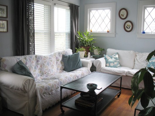
Then added all the details and brought it to life. Most of the items in the room we already had. We just bought new covers for the couches, a new coffee table, a small recycled jute rug and textured curtains which was a great buy. It’s cool how the stuff you may of had for years looks take on a new life in a new home.

We stuck with a cool palette of blues, grays and whites with a touch of brown here and there. All neutral colors that bring a soothing and airy feel to a space. This is my favorite color scheme of all. It makes the room feel fresh, clean and comfy. With the addition of all the plants, its a haven of the earth.

I must say the living room is my favorite space in the house because it is everything I wanted it to be and more. It’s a room where people can gather to hang out, Dan and I relax and introduces guests when they enter our home. It speaks of comfort and peace and has an inviting feel. We LOVE our new living room!

Home Sweet Home: Living Room Redesign

Home Sweet Home: Living Room Redesign

Home Sweet Home: Living Room Redesign

Home Sweet Home: Living Room Redesign

Art Inspired Palette – Arcane Arts

21 Wednesday Mar 2012

Posted by melissaoconnor in Art Inspired Palette, Color Inspiration

≈ Leave a comment

Tags

arcane arts, blues, house, moon, painting, peach, purples, skeleton, trees, underground, what lies beneath

Here is another great piece from Arcane Arts designer, Adrienne Vita. I love this color scheme because it is dark but not gloomy. There is a fun sensibility to it that I am attracted to. Somewhat childlike and definitely fantasy inspired. I think we all wondered at one time, what lies beneath, right? This is a little look into the world that lives underneath us, shown from Adrienne’s perspective.

Organically drawn and brilliantly brought to life, What Lies Beneath draws you in to a space that is quiet, misunderstood and deep. Mirroring that feel are pastel hues that add a touch of whimsy. Together the darker colors help weigh down a space while the lighter peach and blue are soothing enough to bring it all together. This palette would be perfect for a living room or office space as well as a romantic wedding or event.

Arcane Arts - What Lies Beneath

Photographic Palette – Vintage Carnival

08 Thursday Mar 2012

Posted by melissaoconnor in Color Inspiration, Photographic Palette

≈ Leave a comment

Tags

blues, browns, carnival, decorating, design, green, nostalgia, pale, purple, vintage, yellow

With its pale hues and pop of whimsy, our vintage carnival palette brings a unique feel to any space. It brings you back to the good old days where carnival rides and candy make you feel at home and your inner child is set free. The colors in this palette are calming yet exciting and can easily beautify a space by adding that touch of personality and humor a room may need.

Check out Sensational Color’s Pinterest board for more inspiration!

Palette - Carnival Fun

← Older posts
color in films sound in color art inpsired palettes
art and design the home events and parties weddings real weddings color inspiration film-reviews historic places news and updatesminted


minted.com

Enter your email address to follow this blog and receive notifications of new posts by email.

Archives


martha

Magnolia Rouge

Screen Shot 2014-04-23 at 2.29.10 PM

Etsy

Screen Shot 2014-04-23 at 2.18.10 PM

logo

Screen Shot 2014-04-23 at 2.42.13 PM

P&PBlogHeader

wedding chicks


ruffled

Screen Shot 2014-04-23 at 2.47.49 PM

Screen Shot 2014-04-23 at 2.16.32 PM


lauren-elle-photography

jenlombardo

logo_website

site-logo1

kelly_dekenipp_logo

homelogo

Website Powered by WordPress.com.

  • Follow Following
    • The Design Inspirationalist
    • Join 1,711 other followers
    • Already have a WordPress.com account? Log in now.
    • The Design Inspirationalist
    • Customize
    • Follow Following
    • Sign up
    • Log in
    • Report this content
    • View site in Reader
    • Manage subscriptions
    • Collapse this bar
 

Loading Comments...