• About
  • Visit Gray Star Design
  • Minted Collection
  • Design Services
  • Contact

The Design Inspirationalist

~ Inspiring Ideas | Spectacular Creations

The Design Inspirationalist

Tag Archives: dark

Color in Films: Requiem for a Dream

24 Wednesday Jul 2013

Posted by melissaoconnor in Color in Films, Color Inspiration

≈ Leave a comment

Tags

addiction, beach, brooklyn, Clint Mansell, color palette, Coney Island, dark, Darren Aronofsky, drugs, fall, films, Hubert Selby Jr, hues, light, love, nature, obsession, photography, pills, requiem for a dream, seasons, shock therapy, split screen, summer, time lapse, tones, winter

Requiem for a Dream is in my top 5 favorite films of all time. I know it may not be the happiest of films but the story really got to me. Not to mention, the genius filmaking from director Darren Aronofsky. Debuting in 2000, the film captures the true essence of addiction and how it can destroy your life. I must admit there are scenes that are hard to watch but the thrilling anxiety and sadness one feels from watching each character fall apart just makes you want to see what is next. Sad but true.

The film takes place in Coney Island and focuses on four characters, Sara and her son Harry, Harry’s girlfriend Marion, and their friend Tyrone. Each of them have a dream but their personal additions and obsessiveness gets in the way and takes them down the wrong path. From drugs and prostitution to weight loss and shock therapy, the story unfolds as each character falls deeper into the hole they created, taking you on a ride of misery and beauty all at once.

Written by Aronofsky and Hubert Selby Jr., and based off of Selby’s original book, this film will take you on a ride filled with emotion and discomfort. The cinematic artistry with its various split screens, in your face close ups, and time lapse photography, helps to bring the viewer in on a personal level. You feel like you know the characters and even though your heart goes out to them, your ability to empathize slowly fades. Eventually, everything falls apart in the end.

With an amazing and talented cast, Requiem will surely throw you for a loop. The soundtrack by Clint Mansell is beautiful and haunting, one the best I have heard. The color palette is a combination of natural hues taken from the three seasons shown in the film, summer, fall, and winter, while darker, more deep tones exhibit the intense scenes. Darkness and light come into play a great deal as shadows embark each character throughout the film. This is surely a piece of work that will stand the test of time.

Color in Films- Requiem for a Dream

Tips from the Darkside

24 Monday Jun 2013

Posted by melissaoconnor in Everyday Design, The Home

≈ Leave a comment

Tags

bathroom, bedroom, bold, bold colors, color, dark, dark colors, design, dining room, home, hue, interior design, kitchen, painting

Tips from the Darkside

Using dark and bold colors in your home doesn’t have to be dark and dreary. In some cases, they can enable a space to really shine. I’m not saying you should paint all the walls in your home this way, but you would be surprised how much a deep hue can transform a room. Here is a little inspiration to help you choose the right color combination for your home, with a little help from the darkside.

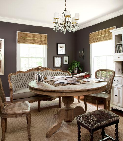
This dark earthy brown helps everything in this dining room pop, giving the space a clean and crisp look. Incorporating other tones of this color family, such as taupe and beige, really bring a classic and opulent feel to the room.
Tips from the Darkside
Photo Credit: Country Living

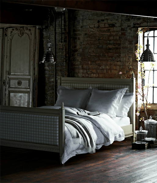
All the natural textures in this bedroom truly bring a unique style and sense of history to the space. It all works together nicely because light hues were incorporated as well. You always need a little contrast to create something spectalular.
Tips from the Darkside
Photo Credit: 79 Ideas

This modern classic bathroom is engaging thanks to the deep navy blue on the walls. It adds a rich feeling to the room and helps to highlight the soft textures in the space.
Tips from the Darkside
Photo Credit: Country Living

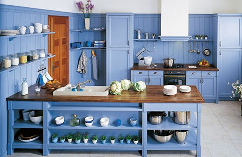
Bold and bright, this kitchen is glowing with cheer. Painting everything the same color is surely a courageous move, but the owners totally pulled it off. The accessories and pots help to break up the space, as does the butcher block countertops and door. The neutral stone floor gives the room a lightness it needs while the white on the top of the walls helps to even out the space.
Tips from the Darkside
Photo Credit: Kitchen Building

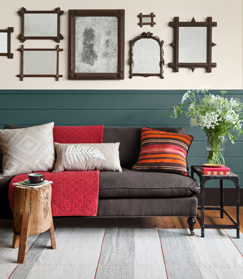
With bold and bright colors used throughout the space, the hunter green backdrop helps to keep it all grounded. The creamy beige on the top half of the wall and light gray rug adds a lightness and airy feeling so you aren’t bombarded with hues that pop.
Tips from the Darkside
Photo Credit: Country Living

Yellow and blue will always be two colors that go well together. It’s the contrast that allows these hues to be roommates. The rich navy and golden yellow in this bedroom/bathroom really makes a statement. It helps to incorporate earthy textures, like the hard wood floor, to break up the boldness. This color combo brings spunk and a touch of intellectual charm to any space.
Tips from the Darkside
Photo Credit: Donkee House

Color in Films: Inception

12 Wednesday Jun 2013

Posted by melissaoconnor in Color in Films, Color Inspiration

≈ Leave a comment

Tags

beige, blue, brain, christopher nolan, city, color, cream, dark, dreams, earthy, films, gray, idea, Inception, mind, movie, muted, nature, palette, tones, white

Inception is one of those films you will remember forever. Not only do you feel you need to watch it a few times, you actually want to. A genius script, written and directed by Christopher Nolan, tells the in depth story of how the mind can do amazing things. The act of inception, in this case, is to implant an idea in someone’s mind but to do it in such a way that they will never know how it got there and actually feel like they thought of it themselves. A brilliant idea for a film I must say.

The cast was amazing and the effects the film explored were truly mesmerizing. The color palette was somewhat somber and city like. Dark earthy hues such as brown and gray teamed up with a scale of blues, beige, and whites for an all around smart and sharp color scheme. Anything but would not have worked. Bright and saturated choices just wouldn’t have made the proper contribution.

This film had me thrilled and entertained all the way through. Not to mention, giving my brain a workout. Superb production in my eyes. Definitely, one of the best films I had seen in a long time.

Color in Films: Inception

Inspiration Photo Friday: Reflection

26 Friday Oct 2012

Posted by melissaoconnor in Inspiration Photo Friday

≈ Leave a comment

Tags

art, building, city, creativity, dark, design, explore, inspiration photo friday, light, manhatten, mind, modern art, MOMA, museum, new york, new york city, perspective, photography, Reflection

This will always be one of my favorite photos I’ve taken. It was captured about 5 years ago while I was visiting the MOMA in the city. I turned around to look out the window and was fascinated by my reflection and how the light perfectly lit up a scene outside where people were gathered. The street seemed bare and quiet except for that one entrance area. And I just happened to be standing right above it.

The dichotomy of this photo will always amaze me. On one side, the dark city. On the other, a moment captured through my lens showing the lighter side. Here my reflection acts as a shadow allowing the darkness to come through while the light that surrounds me, brings attention to the subjects outside. Two worlds coming together. What do you think the main subject is here? Outside the window or in?

Sometimes if you step outside yourself for a moment, you can see a much different perspective than before. Reflections don’t always show you what everyone else sees. They can offer a glimpse into a new realm where the mind can wander and explore.

Inspiration Photo Friday -  © 2012 Melissa O'Connor-Arena

← Older posts
color in films sound in color art inpsired palettes
art and design the home events and parties weddings real weddings color inspiration film-reviews historic places news and updatesminted


minted.com

Enter your email address to follow this blog and receive notifications of new posts by email.

Archives


martha

Magnolia Rouge

Screen Shot 2014-04-23 at 2.29.10 PM

Etsy

Screen Shot 2014-04-23 at 2.18.10 PM

logo

Screen Shot 2014-04-23 at 2.42.13 PM

P&PBlogHeader

wedding chicks


ruffled

Screen Shot 2014-04-23 at 2.47.49 PM

Screen Shot 2014-04-23 at 2.16.32 PM


lauren-elle-photography

jenlombardo

logo_website

site-logo1

kelly_dekenipp_logo

homelogo

Website Powered by WordPress.com.

Privacy & Cookies: This site uses cookies. By continuing to use this website, you agree to their use.
To find out more, including how to control cookies, see here: Cookie Policy
  • Subscribe Subscribed
    • The Design Inspirationalist
    • Join 1,380 other subscribers
    • Already have a WordPress.com account? Log in now.
    • The Design Inspirationalist
    • Subscribe Subscribed
    • Sign up
    • Log in
    • Report this content
    • View site in Reader
    • Manage subscriptions
    • Collapse this bar
 

Loading Comments...