• About
  • Visit Gray Star Design
  • Minted Collection
  • Design Services
  • Contact

The Design Inspirationalist

~ Inspiring Ideas | Spectacular Creations

The Design Inspirationalist

Tag Archives: olive

Art Inspired Palette: Justajar

26 Monday Mar 2012

Posted by melissaoconnor in Art Inspired Palette, Color Inspiration

≈ Leave a comment

Tags

blue, boat, etsy, gray, green, justajar, letterpress, neutrals, olive, red, river, water, wheel, woodcuts

Justajar is a letterpress design shop in Ohio who’s work is hand cranked the old school way and all wood block prints are set by hand. One has to appreciate this fine craft and I must say Justajar pulls it off perfectly.

The work you will find in this shop is witty, clever and fun. Most have an organic feel and  the overall color scheme is inspired by nature. Lots of neutrals and muted tones. The perfect fit for engraved work. The artists behind all the items are talented, skilled and creative to say the least.

Look to their work for inspiration in the home. This one particular piece, sternwheel, is a favorite of mine. I imagine it hung above a fireplace looking grand and stately. The colors for this palette are mild and bright without being too much. It’s a nice mix of tone and value which allow a perfect scale of emotion to take place.

Check out their Etsy shop and show them some love!

Art Inspired Palette - Justajar

Brighten Up Your Space with Spring Inspired Palettes

09 Friday Mar 2012

Posted by melissaoconnor in Color Inspiration, Everyday Design, The Home

≈ 1 Comment

Tags

beige, better homes and gardens, bright, brown, gray, green, navy blue, olive, orange, pink, purple, reds, spring, yellow

Brighten Up Your Space

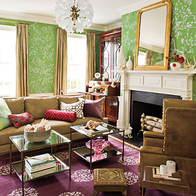
March has finally arrived and with it we have sunny days and cool breezes. It’s time to get ready for Spring and brighten up your space with colors that make you feel alive and happy. This month, Better Homes & Gardens shared a few palettes that are nature inspired and eclectic at heart. These various color schemes will bring warmth, fun and maybe even a little romance to your spaces.

Shades of Purple + Warm Gray
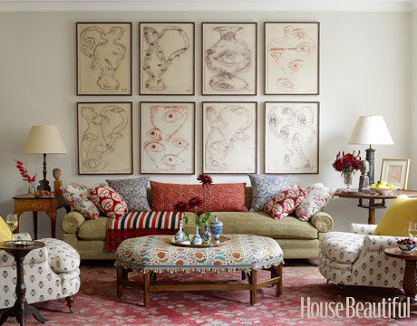
BH&G suggests moody purples with a touch of gray. Since purple can blend with various colors and warm grays tend to calm the purple down, they make a good match. For accents, throw in some citron and berry for a little brightness and fresh feel.

Shades of Purple and Warm Gray

{Misty Lilac: benjaminmoore.com, California Dreaming: acehardware.com, Agreeable Gray: sherwin-williams.com, Tin Lizzie: olympic.com, Glazed Raspberry: behr.com}

Shades of Purple and Warm Gray - Living Room

Shades of Purple and Warm Gray - Living Room

Shades of Purple and Warm Gray - Living Room

Golden Olive + Tobacco Brown
Pairing up tobacco brown and green give a space an earthy warm feel. Choosing an olive works best here. Using yellow, fuchsia and coral as accents add a touch of whimsy and brighten up the dark neutrals. These should be presented in small amounts through accessories or accent furniture.

Golden Olive and Tobacco Brown

{La Fonda Spanish Dancer: valspar.com, Straw: acehardware.com, Mona’s Mane: valspar.com, Tropical Smoothie: behr.com, Jekyll Crane Cottage Green: valspar.com}

Golden Olive and Tobacco Brown - Living Room

Golden Olive and Tobacco Brown - Bedroom

Golden Olive and Tobacco Brown - Bedroom

Golden Olive and Tobacco Brown - Living Room

Golden Olive and Tobacco Brown - Dining Room

Deep Navy + Fog Gray
This classic palette includes strong neutrals and high contrast accents. The navy is the perfect backdrop to the bright but muted fuchsia, turquoise and chartreuse. The gray keeps the palette calm and because it has blue tones it works well with the navy.

Deep Navy and Fog Gray

{Ruby Red: acehardware.com, Jamaican Dream: olympic.com, Savannah Moss: benjaminmoore.com, Hale Navy: benjaminmoore.com, Smoke Embers: benjaminmoore.com}

Deep Navy and Fog Gray - Living Room

Deep Navy and Fog Gray - Living Room

Deep Navy and Fog Gray - Guest Room

Deep Navy and Fog Gray - Kitchen

Color in Films – Last Days

28 Tuesday Feb 2012

Posted by melissaoconnor in Color in Films, Color Inspiration

≈ Leave a comment

Tags

brown, gray, green, kurt cobain, last days, nature, neutral tones, nirvana, olive, red

Last Days explores the final days of Nirvana frontman Kurt Cobain. Writer and director Gus Van Sant truly examines the feeling of isolation in the world with this film. From beginning to end, the darker more rustic tones of nature set the stage for sadness, weakness and the psychological sense of strength that is showcased at the end of the film when the character takes his own life. The rich colors of the cooler seasons embrace the story as it unfolds to its realistic and haunting finale.

Color in Cinema - Last Days

color in films sound in color art inpsired palettes
art and design the home events and parties weddings real weddings color inspiration film-reviews historic places news and updatesminted


minted.com

Enter your email address to follow this blog and receive notifications of new posts by email.

Archives


martha

Magnolia Rouge

Screen Shot 2014-04-23 at 2.29.10 PM

Etsy

Screen Shot 2014-04-23 at 2.18.10 PM

logo

Screen Shot 2014-04-23 at 2.42.13 PM

P&PBlogHeader

wedding chicks


ruffled

Screen Shot 2014-04-23 at 2.47.49 PM

Screen Shot 2014-04-23 at 2.16.32 PM


lauren-elle-photography

jenlombardo

logo_website

site-logo1

kelly_dekenipp_logo

homelogo

Website Powered by WordPress.com.

Privacy & Cookies: This site uses cookies. By continuing to use this website, you agree to their use.
To find out more, including how to control cookies, see here: Cookie Policy
  • Subscribe Subscribed
    • The Design Inspirationalist
    • Join 1,380 other subscribers
    • Already have a WordPress.com account? Log in now.
    • The Design Inspirationalist
    • Subscribe Subscribed
    • Sign up
    • Log in
    • Report this content
    • View site in Reader
    • Manage subscriptions
    • Collapse this bar
 

Loading Comments...